Studio Beyond Walls June 2010
9 Minute Read
The show season had come and gone. With my kids still in school, I was unable to participate in the winter fairs in Flordia. I made a promise to myself to find somewhere to put my art. So for the first time in years, I unloaded my van. I figured my art wouldn't sell itself just sitting in boxes.
I distributed a few pieces to 'The Art Company,' a design firm in Cincinnati. With fingers crossed, I hoped they'd have a prospective job for me. They represented my work for a number of years and a third of my commissions have been contracted through them. I noticed an annual pattern when their clients have purchased some of my larger wall pieces. My luck seems to run from February, March and September-November.
Callie, a designer from 'The Art Company,' called a week later asking me to tweak a sample I had given her a while back. Her client was looking for a 13 x 3 foot piece to hang in their office in a recessed area. Callie informed me the client wanted something that "pukes" California colors!
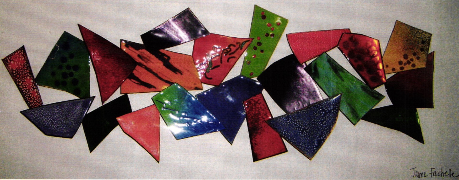
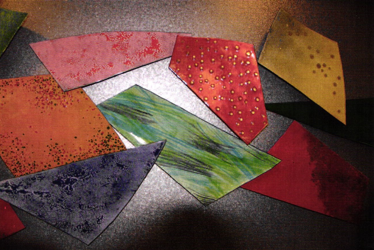
We discussed the necessary alterations and came up with a new design. She was to meet with the client and architects the following week. I found myself having three days to work on a new depiction. I enameled more pieces, each being a different pattern and color, and lengthened it. Callie and I met again for the third revision and specified a color pallet. Now all that was left was for Callie to present the sample to the client (Image #1) and call me with the verdict.
Waiting for that phone call was tortuous. Getting this job could make up for the economy-impacted non-sales I experienced at shows this year. Two weeks passed before I finally got the call.
Good News! They wanted to change a few colors (I guess it wasn't puking California colors enough), but it was for sure a go! Knowing the reality that this was the largest and most expensive commercial commission piece I have ever done; I asked myself "where do I begin?"
First step in the adventure was negotiating the price. We had a deal a few years back regarding my commission and determined the price to be $14,000.00 of which I would receive half. Mind you, that negotiating occurred when I was first getting started. As much as I value the relationship I have with their design firm I realized that selling myself short will jeopardize my business. A renegotiation will be necessary for any future jobs.
The second challenge was size. Most of the pieces are too large to fit in my 12 x 12 inch kiln. But before I could even get to the point of enameling, some sketches and planning were required.
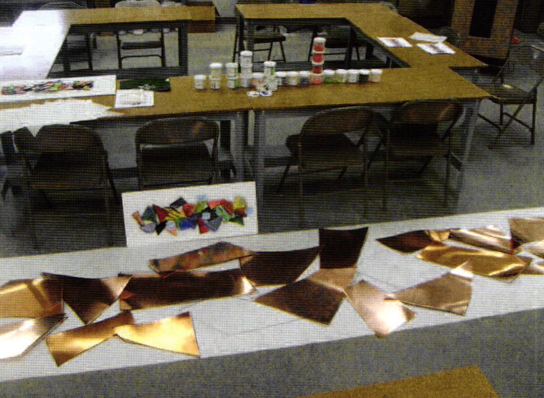
I took a digital image of the approved sample and converted it from a 9 x 3.25 inch picture to 13 x 3 foot. After my third attempt at figuring out the algebraic conversion of the graph, the results were accurate. From this point, the graph and the pieces were drawn out onto the roll paper, actual size (Image #2). Labeling each piece and transferring them onto tracing paper was my next step. I would use these papers as templates.
An important part of this process was keeping the client's needs in mind. They were expecting the finished piece to look exactly like the sample. So keeping a record of the color combinations used to create the sample piece was vital to the success of the finished work.
I took an inventory of the materials I already had and figured out what I still needed to purchase. After guesstimating, the amount came to about $1,200.00. I have learned to always anticipate some errors, so I allotted some funds for additional copper and enamels too.
I seemed to have everything set. I did my math, had exact measures, a working budget - what could I be missing? Unfortunately, the one thing I did not account for was the amount of time it was going to take. I was given only four weeks to complete this large undertaking. Talk about stressing out. Scheduling my time wisely was critical to hitting my deadline, not to mention paying the babysitter. It seemed five hours would pass too quickly. Just as I was getting into it, I found myself having to put my motivational energy on hold to go pick the kids up from school.
Without hesitation, each section of copper was cut to size using a shear. The edges and corners were then slightly bent because of the overlapping and to obtain more of a three-dimensional look. To avoid hammer marks, I was able to hand bend the specific areas over a table top. After the copper was laid out, it was time to finally begin enameling.
I started with white on all the determined pieces, Titanium (1020), Crackle base white (1006) and Foundation 1030). The three crackle pieces were then coated with a sifted layer of transparent enamel. Mandarin Orange (2840) was on one piece, Harold Purple (2720) on the second, and Sunset Orange (2850) on the third. Immediately the problems began.
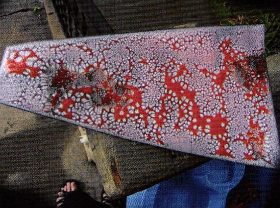
Unlike my small sample pieces, the transparent enamel popped off in sheets. An attempt to repair was successful, but unusable for this project (the interesting thing that resulted from this error was that I liked the results and will use that technique in the future). There was more separation within the separation. The repaired areas were a shade darker because of the thinner base coat and the crackle was denser. This left defined lines which show the ability to be controlled (Image #3).
After much discussion with Bill Helwig and Mr. Carpenter from Thompson Enamel, we concluded that I was not using the crackle base as intended. But it worked with my samples, so I was determined to figure out a way to make it work now. Finally I achieved the desired results. I learned the trick was to use counter enamel with the same expansion as the enamel on top. To get a good crackle look, I fired two coats of the white base (not too thick) and the transparent second coat had to be sifted on evenly completely covering the white. It was fired at 1700° F. for about 3 to 4 minutes.
It seemed the two colors needed to fuse as one, when using the crackle base this way. This concept went against the overall idea of the separation enamel where the viscosity changes, producing a spreading. Next, I enameled the Titanium white pieces; one with Mikado (2845) and the other I painted Klyr-Fire on, emphasizing the brush strokes, overlapped blue, greens, and black with multiple firings. Over firing the titanium produces a separation effect, with denser, splotchy results. But, it needed to be dealt with the same way as the crackle base.
The pieces on the Foundation white were enameled with different transparents which added bold colors to the overall design. I applied lump enamel to some pieces with water cooled, large flake, and opaques cooled. I was able to go through the barrels in the factory to pick out the size lump that I needed, which was actually pretty cool.
A few sections were a single transparent color blended into another. With one piece, I covered the copper with silver foil and used Gem Green (2325) then fired to an orange peel finish. This added a brilliant contrast and additional texture. Finally, it was time to deal with the mesh. I decided to save the experimental piece for last.
I used the impression mesh and laid it on the flat enameled copper (Marigold - 1830) then fired and smoothed it completely. It was pickled then and more enamel was applied. When it was hot, coming out of the kiln, I was able to bend the edges down a bit. Although it was working, I found the color displeasing. Being that the mesh is so thin, I covered it and tried it again on the same piece, with similar results. Sigh, Time to begin again.
I had purchased some thicker mesh a while ago and thought I would give this a try. But it was unsuccessful for the third time and now only 5 days until the install! There was no denying that I was beginning to panic. I again went to Bill for advice. It was decided to eliminate the mesh all together and just use the opaque lump sporadically to achieve the look I was going after; at last, all 21 pieces were completed.
After taking them all home, I laid them out referencing the sample. Each piece now needed to be mounted. Keeping in mind the overlapping, the angles and their weight, I decided to use two 4 x 4 inch blocks of wood which also needed to be cut at different angels. They were siliconed onto the backs and let to dry for a day.
Callie and I had discussed how the pieces would be installed and affixed to the wall. It was agreed that she would attach the hangers but somehow I got stuck doing this job. Out of respect to myself, I added an additional charge for this new task.
Finally, the day of delivery arrived. Over the years I have come to realize many things about myself, and being picky is one of them. Because I can be so particular about the hanging and precise placement of each piece, I decided to do myself and the project a favor by not attending the installation. Now all that was left was to hear how the piece was received by the client.
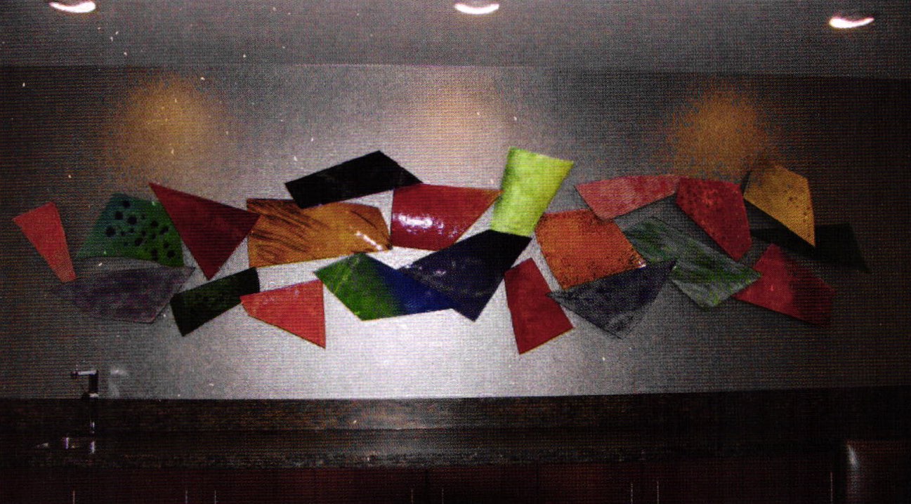
After about a week, I finally received a call, letting me know that the client was very happy and all the pieces passed inspection. I was then informed exactly where my piece was located. To my surprise, it is displayed on the penthouse floor of the Scripps Howard Building, downtown Cincinnati. Mine was the second largest enamel mural installed within this building, the other belonging to Bill Helwig.
I was ecstatic to learn of its placement and couldn't wait to see it in person. Two months passes and I was finally escorted up to the penthouse floor to view my work (Image #4 and #5 close-up). Being the picky perfectionist that I am, I realized I should have been there for the installation. I found myself fixated on some of the pieces that were not in their designated places, and the differences in angles. I also found the lighting on the piece to be poor.
All in all, this was a huge learning experience for me and I am proud of the work I accomplished. The major lessons I learned I will take away are: that I will have a better idea of how to price art of this magnitude, get everything clearly in writing, and allow a reasonable amount of time to complete the art. Oh yes, I will also get all those things done without losing my mind, hopefully.
While this wasn't the most enjoyable experience I've ever had, it is one of the most educational projects I encountered; both in a business sense and moreover, as an enamelist. Sometimes it truly pays to simply unload your van and see what the future brings.
To see more of Jaime Frechette's work, visit http://enamelartist.com/
Related Articles

Studio Visit – Doug Wilson

The Goldsmiths: Studio & Shop

Studio Visit – Jack and Marilyn da Silva

Studio Visit – Tom Joyce


The All-In-One Jewelry Making Solution At Your Fingertips
When you join the Ganoksin community, you get the tools you need to take your work to the next level.