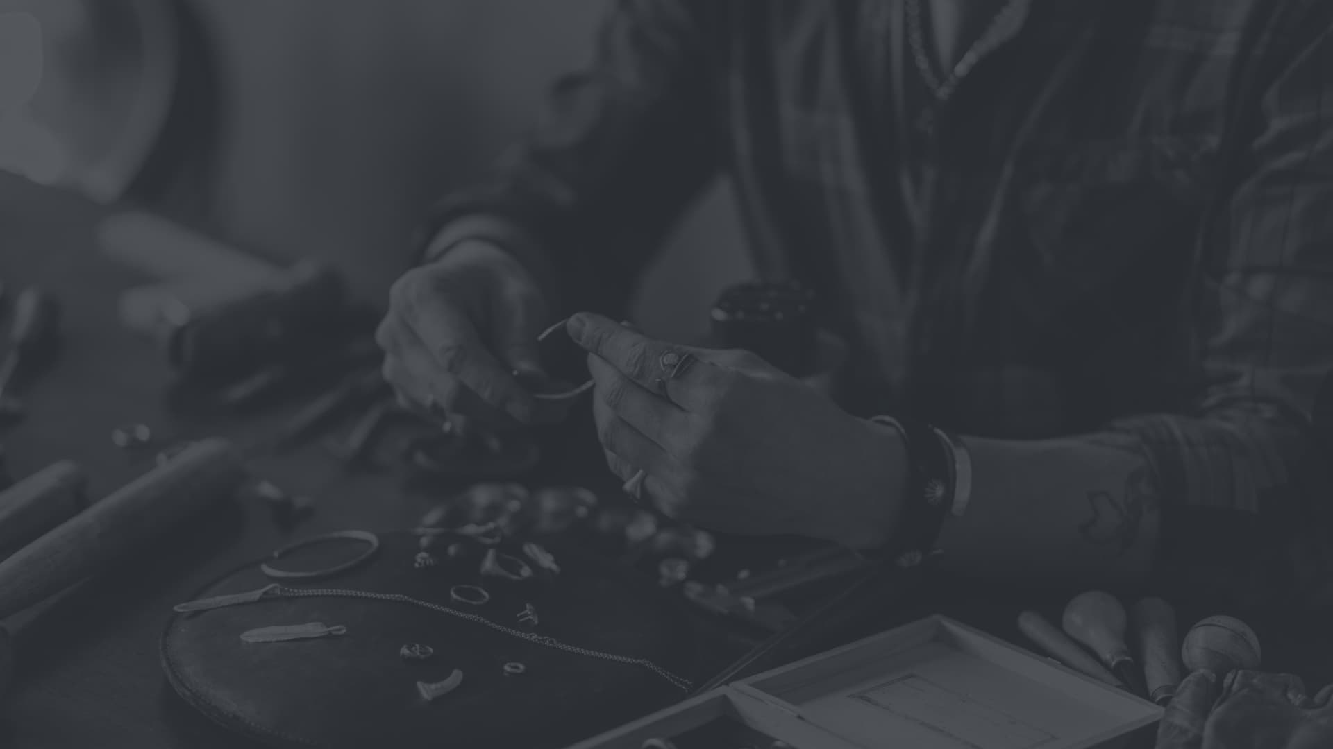
Ins and Outs
18 Minute Read
I.
We began the jurying of the 1996 Exhibition in Print by passing the morning in silence, looking at the slides jointly but scoring them privately. Our task was to cut the number in half. We established no ground rules. Each of us rated the slides high or low according to our instincts or biases. Then we took a leisurely lunch while Vernon Theiss and his team added up the numbers. We returned to see what had survived and to cut that number in half again. In the second round we were free to discuss what we saw, and it was then that the process become both more difficult and more interesting, for several issues arose that are essentially unresolvable.
One was the matter of seeing slides rather than real stuff. What got through the first cut was simpler and more graphic things rather than those that, say, express contemporary complexity or chaos. It was accident, rather than policy. I was surprised, for although I might lean toward clarity or graphic contrast, I don't make a yes/no, good/bad distinction and I did not intentionally choose simpler pieces. We discussed this outcome and supposed that the simpler works are easier to read, easier to get in slides, and so have a structural advantage over complexity. They're more understandable pictures, and, after all, we were judging pictures, not objects.
I had expected to be the odd man out on this jury. Although Gaza is not in the metals field, she and Pat are both makers, so I assumed they would respond to the work differently, see different things in it, than I would. My experience of art is solely as a viewer, my experience of jewelry solely as a user. But in the two-to-one votes, often Gaza and I were on one side and Pat on the other. There are at least two possible explanations. In a couple of cases the split was clearly due to Pat's knowledge of metals precedents and techniques. Once, Gaza and I responded favorably to a piece while Pat was appalled to see a seam at the front. I suppose a metalsmith could use a visible seam as a statement of rebellion, or it could even be built into the piece as a design element, in which case it would seem integral. But here the seam contributed nothing visually or conceptually, so we eliminated the work.
In another case, Pat told us that what we were seeing was quite derivative of someone else's better work. Ah: the institutional dilemma of medium-specific jurying. How could we say, how could anyone say, whether Pat's knowledge of the precedent clouded his ability to recognize the strength and satisfaction of this particular work, or whether Gaza and I would have instantly tossed out what we were seeing had we known the work he knew? This situation is going to arise every time a field asks outsiders to jury. We outsiders look without context, taking each piece on its own terms, whereas someone from within the field will always be comparing and ranking.
A contributing factor is the matter of originality - a problematic concept, yet one usually treated as clear-cut. I'd bet diligent research could nearly always find a precedent for a style associated with a certain artist, whether a metalsmith, painter, or whatever. Someone becomes associated with a certain style or image or material or subject even though in fact he or she is not the first to use it. That happens nowadays and it happened in the past, as well: we know that Shakespeare borrowed characters and plots from existing literature. He wasn't original in that sense. But what he did, he did so well that we're more interested in his work than in the original. So the question is whether the work should be judged alone or in comparison. Comparison depends on what the juror knows, so there will be a big difference between insiders and outsiders. Can insiders be impartial? Can outsiders know enough about what's important? (And what is important?)
Another possible explanation for our two-to-one splits, which we mentioned in passing, was gender. This is such a can of worms that I don't think we wanted to seriously consider it. But gender-based reactions are possible. What's happened in the art world since the rise of feminism at the beginning of the '70s proves it. When the ideal in art was the tough stuff of Abstract Expressionism, few women were successful, and in those days critics could make disparaging remarks about the personal and ephemeral things that women were often interested in. But with feminism and the acceptance of subjects and styles that women choose, there are now huge numbers of women doing work that's considered important and leading-edge. I don't know how it goes in metals, a field not dominated by one gender. And there's no way to test whether Gaza and I saw something from a woman's perspective that Pat didn't, so it would do no good to worry over it. We did find some things to agree on.
Another issue the jury faces was standards versus invention. In jewelry and small sculpture we responded to the new. But some musical instruments were submitted for consideration. Oh, boy. Already, because we were dealing with the visual alone in these slides, we had disregarded the function of the objects we were judging. We said nothing about whether clasps were easy to use, or whether a piece was too heavy or too sharp to wear. We can't judge those things in slides, so they aren't considerations for the Exhibition in Print. But a musical instrument has to conform to standards of construction so that it will make the expected sounds and so that the player will know how to use it. If you get inventive with a musical instrument, you've made a new instrument. Looking at slides, we could have no idea of sound or handling, and if the instrument conformed to the expected appearance, then we couldn't see anything new. We eliminated instruments because we didn't know what criteria to apply.
Another issue is virtuality. An Exhibition in Print is, of course, a virtual exhibition, not a real one. It consists of representations. All slide jurying slips from the real to the represented, and I believe that in ceramics at least, constant dependence on slides is leading to changes in work, which is becoming more frontal or pictorial and less tactile or sculptural (even when you see it on a pedestal and you know it's 3-D, the impact is entirely through image). I don't know if the metals field is being affected in the same way, but in any case, the fact that this exhibition will be seen only in the form of photographs makes the images doubly important. It seems inevitable that someone would submit for jurying a virtual work to be included in the virtual show. Margaret Yaukey did. We decided to face the problem head on and accept her work. In the magazine it will look fine with its Darth Vaderish synthetic appearance. But if this show is turned into a real one, as the first Exhibition in Print was, Yaukey will be in trouble. Will she exhibit the computer design she entered, placing it on a pedestal or in a display case, or will she realize the work? And what if she does that and isn't entirely successful? Her real piece is not what was juried in. Perhaps the exhibition entry rules will have to insist that the submission actually exist. We can thank Yaukey for forcing the issue inherent in this notion of a show.
Another problem - not really an issue, I suppose - was the prevalence of very long artist's statements. I don't know whether this is the usual (Frank Lewis said it was not the case the first time) or whether it's becoming so. We jurors were dismayed when we asked for a statement to be read, only to find that it was multiple paragraphs long, or even multiple pages. We never listened to the whole of any of those tomes. I find it hard to imagine any reason that would justify such length. These are objects of visual art. Should they not speak by visual means? If a concept is so complex that it must be explained in multiple paragraphs for the object to be fully appreciated, then the main point seems to be the concept rather than the object. The object is reduced to being an illustration or an instance, in which case it's unlikely to be as powerful as a work that invests its every aspect in its objectness. I'd say: if you need to write an essay, do that and skip the object.
My fear, perhaps an overreaction, is that long statements might reflect the contamination of the metals world by the current fine-art preference for text. If so, this would be yet another example of the crafts world selling its soul to convince the art world (which doesn't care anyway) that crafts is the same as art. The first instance of this, the abandonment of function, seems less true in metals than in ceramics. But the supposition that words rather than visual aspects can best express meaning will only lead to the creation of works that are best expressed in words! I urge makers to put the smallest possible number of facts and explanations into the statement. (I might add that the jury doesn't need to know the artist's life story; artists' statements should not be opportunities for confession.) Just compensate for relevant things that can't be seen in slides, not for the things that can't be seen in the object. Trust your work to speak for itself, and if it doesn't, make something that does!
II.
The submissions, and the survivors, ran the gamut, but with a great preponderance of jewelry, and also some usable objects, which suggests that the bond to function is tight in metals. In addition there were several works that stretched the boundaries of the field. Often "exceptions prove the rule": by their differentness, these works point to some of the things that are important to metalsmiths.
David H. Clifford's work is a process more than an object. He buys a used coffee pot at a thrift store, paints images on it by engraving and anodizing, and after exhibition surreptitiously returns it to the shelves of the store to be discovered and wondered over by finders. This process does not come across very clearly in five slides. Had the work not been written up in the Fall 1995 Metalsmith, I doubt that it would have made the cut. But it raises very interesting points. Clifford's actions give a preciousness to the work on the basis of touch and time, not materials. All three of these are craft values, but Clifford's choice of object and imagery might make finders suppose that he is a folk artist, because there's a populist cast to this whole project that is quite outside the elitist stereotype of art. At the same time, however, the idea is conceptual, so it's easy to image Clifford's documentation of his activities being made into an exhibition in an alternative space, with or without the coffeepot. In this work, the object is a means, not a result.
Peter Diepenbrock has made an installation piece that would also be at home in a gallery, as contemporary art. He made a 18-by-18-foot floor of steel plates, under some of which he stowed various tools and artifacts. This piece, like Clifford's, provokes one's curiosity but does not reveal enough in the limited views offered by slides. It's hard to get a feeling of the presence that would be established by its size, its sense of weight, its cool hardness when touched, and the quality of sound that would result if one could walk across it. Also, a glimpse of only one or two compartments is possible in the slides, while in person more would be available. The objects in the compartments are protected or preserved; they appear to be real-life items so they fall within the typical scale of metalsmiths' products and have the intimacy and directness that one associates with such things. There also may be a spatial experience involved in this work in real life, because it is vaguely suggestive of a file cabinet, but that's not something we customarily walk on, so standing on this work could be disorienting.
Lin Stanionis's Eden of Eros II is also revealing of the scale and preciousness aspects of metalsmithing. This is a ritual vessel, perhaps even a sacred vessel. The cup takes the form of female hips, belly and pelvis. The stem consists of two entwined snake-like elements. One might think of the paired snakes of the medical caduceus, and that seems to relate logically to this portion of female anatomy most central to reproduction. But a snake, of course, is also associated with the temptation of Eve in the Garden of Eden. The cup rests upon a nest of branches with large terminal buds. They evoke spring and the renewal of life, and that association also ties in with anatomy and the caduceus. But one can't help noticing that these branches are phallic and also weapon-like. And more striking, the pile of them suggests a bonfire, at which, perhaps, the female is being sacrificed. One notices, too, with what sly force the snaky coils screw into the base of the figure.
All those implications seem embodied (no pun intended) in Stanionis's goblet/chalice. It is so ripe with meaning that it, too, would seem to easily transfer to an artworld setting. But the preciousness of sterling and the intimate scale and exacting workmanship of the piece would be strange in a fine-arts gallery. The chalice would have to be treated like an artifact, displayed in a vitrine. If it were made of aluminum or papier mache, or if it were life size, it would shout the same meanings. As Stanionis made it, it's a whisper one must bend close to hear. It's exquisite, and thus most likely permanently confined to the context of metalsmithing.
Among the objects, I find Lisa Slovis's Shakers engaging - although I'd be more excited if you could actually shake some seasoning from them rather than just shaking for sound or other amusement. The forms are so marginally familiar that she has provided instructions as part of the surface decoration - see the piece Place Palm Here. Gathered together, the shakers are strikingly festive because of their Formal animation. They look like a flock of penguins, each in its own self-involved and slightly absurd posture. The surface texture of handprints leans toward abstraction.
The vast majority of the works accepted, as noted, are functional jewelry. I sorted through the slides to see how I could group them, and came up with: organic, colors, motion, body frames, and containers (a few works fit no category). The organic category includes works that look inward (Paul McClure's heart and lungs pendants, beautiful but tumorous; Melissa McGraths's translucent plastic cell pendant that looks like a sea creature illuminated on a microscope slide). Other works look outward (Deb Todd Wheeler's rings from which attenuated vegetation climbs; Sue Amendolara's exotic blossom in fierce foliage; Nina Neily's Excauation Shield #6, which looks like a map and catches some race-memory of the primordial world - and it is also as beautiful from the back as from the front). Sarah Perkins's cups evoke both the veining in marble and the accidental beauty of stains. The organic seems both geologic and metaphysical in Donald Friedlich's slate brooches; these austere forms with their reductively sensuous surfaces remind me of Japanese Zen-style stone sculpture that expresses the cosmic by means of the specifically but subtly physical. (Tom Joyce's forged works are not organic but, like, Friedlich's they have a Japanese quality of simplicity and elegant asymmetry.)
Among pieces that concentrate on color, Patricia Telesco's brooches are like tiny autumnal abstract paintings or collages, while Pier Voulkos's necklaces of translucent polymer clay are baroque in organization and effervescent in mood. Flora Book and Louise Borgen have constructed jewelry that probably rules the behavior of anyone who wears it. It perhaps looks back to the extreme and geometric European jewelry from the '60s on (I'm thinking of Gijs Bakker, David Watkins, Caroline Broadhead, and others). But the cool hardness of the metal also seems timely - maybe because of the current prevalence of body-piercing, a self-inflicted torture that makes earlier avant-garde and oversized jewelry seem decorous in comparison. Rachelle Thiewes's Ring of Thorns bracelet has only a twinge of S/M but would seem to have an attention-drawing degree of movement and probably a notable jangle. Karen McCreary's bracelet and pin of plastic and electronics escape the labored novelty of the first LED pins; these seem to take easy advantage of the technology to achieve visual dazzle without concern about making-a-statement-of-our-time. Chris Darway's rings supposedly don't require sizing because they consist of various sorts of adjustment devices. But the appearance celebrates mental playfulness, skill, and the fascination of working forms. Darway must be the sort of person who combs through hardware stores just for the pleasure of it.
Another hardware aficionado is Kiff Slemmons, who has produced playful boxed sets of rings in familiar forms: ruler, pencil, crescent wrench, hammer, protractor, and other identities familiar in the world but surprising in jewelry. These make no particular social statement, but a word person would appreciate the wit of the titles and, being alterations of the familiar, they would probably be the kind of jewelry an owner grows fond of. Tara Stephenson also creates a surprise: a compact that holds, opposite the mirror, chocolate. One would apply this to one's face, but might wear it in the form of extra pounds. This conjunction is amusing; Stephenson's Bulimia Bracelet, with its tongue depressor and its bulky form, is still witty but also chilling in its reference to bizarre practices of consumption that reflect upon women's self-images. Morae Kim's brooches are skillful balances of a shape that equally suggests the vase and the female form - both elegant containers. j.e. Paterak puts little circles or squares of printed text in a box that becomes part of a pendant - so are these excisions to be seen as precious and treasured, or as censored and locked away?
Ben Cunningham's jewelry is an AIDS memorial. The rosary form has one counting pills instead of counting beads. Cunningham is bluntly representing a contemporary health problem; his piece hasn't the irony of Tara Stephenson's objects - nor of Fred Tomaselli's contemporary paintings made by embedding a variety of pills decoratively or depictively in resin (Tomaselli's work was coincidentally on view in San Francisco when the jurying for the Exhibition in Print was taking place in the Bay Area). This and Cunningham's button rosary perhaps make up in earnestness what they lack in complexity.
As an outsider I can make no summary. Every jurying process is a combination of conscientiousness and accident: if we three met again in a darkened auditorium, the particulars of the show would undoubtedly be different. But there was much that satisfied me in what we saw - technique is not forgotten, neither is meaning and neither is pleasure, and the works of these 42 artists represent a happy range. I don't much care whether it's the last word.
III.
My approach to criticism is analytical but not theoretical. That is, I'm interested in looking intently, thinking about what I see and trying to make sense of it, but I'm not concerned with adding to a scholarly ediface by basing my work on the writing of others. I do this kind of work (and it is hard work) because of the personal reward: direct contact with the art work. When I agreed to be a juror for the third Exhibition in Print and to write the essay, Frank Lewis sent me the issues of Metalsmith that were the first and second exhibitions. I read them only after I had finished writing the first two sections of this essay. They cast a new light on the task.
The members of the editorial committee, who were the jurors for the first exhibition, published a statement of their expectations, standards, and goals in response to the enormous number of submissions they received for their novel project; for the same exhibition, Mary Douglas's deliberate and perceptive essay sorted out the current situation in the metals world and noted how it defined itself. The next year Daniel Jocz, as the sole curator for the second exhibition, chose certain types of works but in his essay looked far and wide - as well as very deeply - into the defining characteristics of metalsmithing today.
This third Exhibition in Print, l now realize, has two momentous departures: two-thirds of the jurors come from outside the field, and all three jurors have no special position and no particular stake in the exhibition. (Pat is a metalsmith but not a teacher, so there could be no temptation to validate his academic stance through his choices.) That means that this is the first open exhibition, the first unformed one, the first to simply go with a process, enjoy the discoveries, and accept whatever happened. This year the juried Exhibition in Print becomes a means of access to the pages of Metalsmith, and only that, open to anyone willing to submit his or her work to the unpredictable personal judgments of three people who have nothing to prove. I suspect that the difference will not be terribly apparent in the illustrations published here, because the previous jurors were admirably judicious, but it will be obvious in the less intense, less argumentative approach of this essay. But maybe there's something to be learned merely from what an outsider chooses to discuss. And maybe there's something to be gained from the democratic imprecision of an unfocused process.
Related Articles

Forging Modernist

The Boulle and Bjo Rue Du Louvre Colleges

Borneo and Beyond

Jewelry Designs: Maya Pendant


The All-In-One Jewelry Making Solution At Your Fingertips
When you join the Ganoksin community, you get the tools you need to take your work to the next level.