Coloring Techniques for Metalsmiths
Jewelers are a restless and inquisitive group. Not content with producing sumptuous jewelry, they spray it with chemicals, dip it in acids or torch it. Just to see what happens. On a good day, what happens is colored metal. However, the unpredictability, potential toxicity, and the subdued color range of these patinas has driven a group of outsider jewelers to experiment with new ways to put color in its place: on sterling, copper, aluminum, and steel. Instead of reaching for chemicals, acid, or heat, these colorists improvise with low-tech materials and experiment with new techniques that welcome spontaneity back into jewelry making.
13 Minute Read
Jewelers are a restless and inquisitive group. Not content with producing sumptuous jewelry, they spray it with chemicals, dip it in acids or torch it just to see what happens. On a good day, what happens is colored metal. However, the unpredictability, potential toxicity, and the subdued color range of these patinas has driven a group of outsider jewelers to experiment with new ways to put color in its place: on sterling, copper, aluminum, and steel. Instead of reaching for chemicals, acid, or heat, these colorists improvise with low-tech materials and experiment with new coloring techniques that welcome spontaneity back into jewelry making.
 |
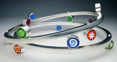
| Lulu Smith's Junction bracelet, with pigmented resin in sterling silver. Photo: Douglas Yaple. |
Alumin- ating
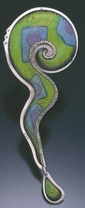
When film director Federico Fellini said, "If metalworkers didn't dream, there would be only a hunk of metal," he might have been describing Jane Adam's jewelry. If Adam didn't color her jewelry, there would only be a hunk of aluminum.
"I started working with aluminum when I was a student in London. Certainly in this country there was a movement in the '70s looking towards new materials and new means of expressing the new jewelry," says Adam. "That's what caught my imagination because I was always interested in color and patterns and not particularly interested in the kind of preciousness and the status of precious jewelry. I wanted to do something a bit more new."
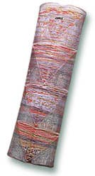 |
| A brooch of monoprinted and dyed aluminum and stainless steel wire by Jane Adam. Photo: Joel Degen. |
That's an understatement. Adam has succeeded in doing the unthinkable: transformed a valueless industrial material into iridescent, wearable artwork. After 20 years of experimentation, Adam has developed many new ways of applying and sealing color on aluminum, a technique whose time has clearly come.
"Aluminum has tended to be seen as an industrial material, and so very few people were using it as an alternative medium in the studio. My interest happens to be pattern and mark making, layering color and texture. I found that there are many, many mark-making techniques suitable for aluminium, if you know how to apply them," says Adam.
The aluminum Adam usually works on arrives anodized, ready to be marked and painted. Anodizing is the electro-chemical process that gives aluminum a hard, transparent surface layer of aluminum oxide. This colorless layer permanently absorbs the dyes and inks Adam daubs, prints, and stamps with rubber stamps.
"The secret to sealing the colors - and it's no secret really, it's a fairly standard industrial process - is that it's boiling water that causes the chemical reaction that seals it. The trick is that the anodization happens first of all," says Adam.
Working with aluminum is a challenge because, although it can be soldered, it is very difficult to get good results once it is anodized. Adam solves the problem by using cold connections to combine aluminum elements with silver, gold, or stainless steel. She finds this restriction important as it demands creative solutions and adds visual spurs to her work.
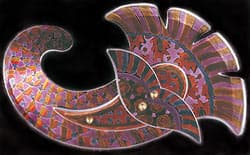 |
| Anemone brooch, of dyed aluminum by Jane Adam. Photo: Jane Adam. |
"Aluminum is my canvas. I think about changing it, but so far, this material has gone along with me and every time I've tried something new or gone in a different direction, it has allowed me to express it and I've found ways to work with it. It's as versatile as paper or fabric, has endless possibilities for decoration and mark making, and it's cheap. The whole value of the piece lies in my work, rather than in the inherent value of the material, which is most important to me.
"I think these days there's a greater acceptance of jewelry in non-conventional material like aluminium because people are used to seeing it. And they're looking for something a little different. Maybe they're prepared to spend a little more on something that they see as beautiful but not for conventional reasons. Jewelry is a funny one. Certainly in the United Kingdom, when people look at jewelry they think in terms of bullion, or what the materials cost. There's no other art form where that happens: people don't look at a painting and think it must have cost at least £1,000 in oil paint. It's a question of moving people towards understanding that, which is why I'm writing a book on coloring anodized alumiunum." says Adam.
Colored Pencils and Patience
Deb Karash applies color to copper the slow way, using colored pencils and patience. She saturates the metal stroke by stroke, layering and coloring until the metal reaches a velvety depth in which brass rivets glow like embedded jewels. Karash was seduced by color in the late '90s, when she began cautiously introducing color into her jewelry with stones. The variegated hues within a single color, especially turquoise's mix of green, gold, and rust inspired her to try and reproduce the color on metal using colored pencils.
"After a while I enjoyed coloring so much that I didn't need the stones anymore, I just wanted to color the metal. That's how it started. Now all the color in my work is colored pencil. I'm not a color fanatic - my home is neutral and I wear black. I simply wanted to do something different to metal surfaces. When I began using pencil, the biggest issue was how to adhere the color to the surface. I knew other people used colored pencil on metal but I didn't really have the courage to call them to ask how they did it," laughs Karash.
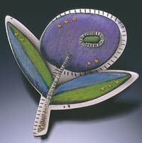 |
| Brooches by Deb Karash. Photo: Larry Saunders. |
Colorizing metal is only half the problem; the other half is keeping it on. Karash experimented with layering color for five years, and along the way, discovered a way to seal the color permanently. Her 30-step process begins with drawing on textured copper that has been chemically patinated green. In the beginning, Karash applied color sparingly, allowing the patina to add a weathered fresco look to her pieces. Now, the layered pencil color is so dense it completely hides the patina.
Karash's jewelry is double-deckered: silver is the bottom layer that carries all of the findings, and copper sits on top, holding the color. She uses multiple shades of Prismacolor pencils to create one color, shades with black pencil and sprays fixative between layers. The final layer is sealed with Renaissance Wax and brass rivets applied to hold the two layers together.
"Jewelry, for me, is really about intimacy. Windows, layering, and texture are metaphors for the mystery and richness of personalities. Jewelry becomes a part of people's lives and stories. I enjoy participating in the marking of significant events in their lives and hearing the stories they tell me about their jewelry. Throughout history humans have adorned themselves in a variety of ways. I feel a part of that history, if in a very small way. I draw inspiration from natural textures, fiber, stone, and mixed media painting and sculpture. Surface, color, and texture are as important to my work as are the forms themselves."
Karash's new jewelry is jumping with color and patterns inspired by vintage fabrics from the '40s and '50s
Dipping into Design
Donna D'Aquino's elegant, minimal wirework jewelry holds only three colors: black, white, or red. D'Aquino draws with black wire instead of charcoal to create three-dimensional drawings meant to be worn as jewelry and enjoyed as art. When not worn, she recommends the jewelry be hung on the wall, beneath lighting that casts sharp shadows, in order to transform the jewelry into drawings that float along the wall.
D'Aquino purposely chose black binding wire, a "throw-away" material, to create bracelets and brooches that question preciousness in jewelry. She adds color by dipping them in Plasti Dip®, an industrial material usually found on plier handles.
"The work that I've been making since 1998 is very direct; there's minimal soldering, and it's all done by hand without it being overly technical. My approach with the dip is exactly the same. I open the can of Plasti Dip®, mix it, dip the jewelry, then let it set overnight," says D'Aquino. She points out, "This is a highly toxic material to breathe so I wear a mask."
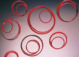 |
| Donna D'Aquino's Scatter Pins are made of steel and colored with a plastic dip. Photo: Ralph Gabriner. |
D'Aquino's work has been influenced by a fascination with architecture, the Russian Constructivist Movement of the early 20th century, and The Modern or New Jewelry Movement of the '70s in Europe, which pushed the boundaries of what defined jewelry.
"I strip the designs to their essentials while sometimes adding a touch of playfulness. I do use some sterling and gold but primarily I'm applying the color to steel. Interior and exterior architectural structures used for building skyscrapers, bridges, and telephone towers all inspire my work. My original training was in graphic design - I wanted to be an illustrator, and I think that's why most of my work is either black, white, or grey. Dipping was a way to incorporate a touch of color. I chose red because it's dramatic, people are drawn to it, and it maintains the piece's graphic quality," says D'Aquino.
Resin-ating
Technically, resin is glue, the result of slowly mixing together two-part epoxy consisting of a catalyst and a hardener. Once cured, this tough medium can be drilled, sawed, and polished. It's tough but obliging, because resin accepts color any way it comes: from a paint tube, pencil shavings, or the spice rack. Resin's low cost, accessibility, and user-friendly qualities belie the expertise required to whip glue and color into elegant jewelry.
Resin meisters Victoria Varga and Lulu Smith have continually pushed the limits of resin, creating color-infused jewelry with luminosity that challenges the beauty of precious stones.
Victoria Varga's stacked jewelry is one part sterling and one part sunshine. The glow comes from a mix of resin, 23-karat gold leaf, and powdered stones over which Varga floats sterling designs, techniques she developed 15 years ago.
The process begins on the computer, where Varga creates a template of nature-inspired designs. She sends these for etching and, once she receives the sharply etched stars, hearts, petals, and leaves, Varga begins to construct each piece. She adds the silver designs to sliced tubing, which acts as a bezel, and pours in a layer of resin. When using gold leaf, she lays down a clear layer of resin first, then cuts and applies 23-karat gold leaf with a cotton swab. Once this cures, she adds another thin layer of resin mixed with mica, over which she pours a final layer of resin.
"In 1995, the San Francisco Museum of Art asked me to create more geometric patterns based on the architecture of their new museum by Mario Botta. These days, I tweak and distort images to create clean, bold graphics. My new work is inspired by African shields," says Varga.
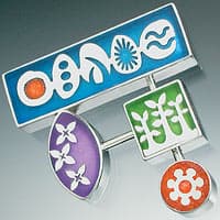 |
| Image courtesy Victoria Varga. |
Resin is the glue that binds color to sterling. It also binds intangibles like artistry, ingenuity, and control of the medium within the sparkle of Varga's designs. Resin may be merely glue to some, but it is magic when Varga is through with it.
Seattle jeweler Lulu Smith was searching for a medium that would combine her background in ceramics and painting and give her more control over color when she took a resin workshop at the Penland School of Crafts. She was hooked. In 1998, she began creating resin jewelry in which metal was clearly only a vehicle for color.
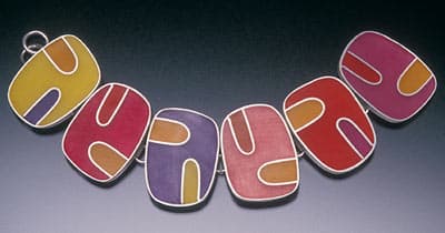
Smith begins by collecting eight to 10 pieces she plans to color in one color group then scratches the inside for better adhesion. Small batches of hardener and epoxy resin are mixed on wax paper, and then the excitement begins. By adding any non-oil based material like water colors, gouaches, acrylics, or raw artist's pigments, Smith can create any color ranging from translucent to opaque. Once pigment is mixed into the resin, it is poured into the jewelry's compartments, which Smith separates with bezel wire. It dries overnight, then is ground flat with an abrasive wheel.
Smith's clean-edged, exuberant work gets its glassy depths from multiple pours, blending many colors together and pouring colors in groups or 'families' that make sense together. Smith cites a love for Japanese comics, which tries to capture motion in its still form, a long-term romance with 'concepts of the future,' and recent discovery of synesthesia, as influences on her work. Synesthesia is an involuntary physical experience in which one stimulation evokes the sensation of another as when hearing a sound produces the visualization of colors.
"I'm not a classic synesthete, but I believe artists, by definition, have their own secret language in materials and ideas, and I do often relate colors to people, ideas, or experiences and I'm sure that goes into what I make on some level. Working with resin has made me curious about plastics and other alternative materials that became available during the industrial age, and their relevance and importance to contemporary jewelry. They've really changed aesthetics in our modern world and will continue to do so in the future. It's that vast unknown that really excites me - where will color in metalsmithing go with the advent of all these new mediums? For me personally, I saw how challenging it is to work with a new material and how coloring it was really an art form in itself."
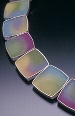 |
| Big Pillow bracelet, by Lulu Smith, who uses pigmented resins to add color to sterling silver. Photo: Douglas Yaple. |
Imperfect, Impeccable
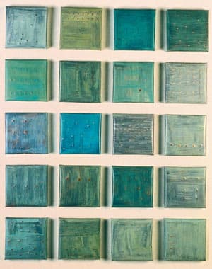
Brooke Marks Swanson is a born colorist. The daughter of artists who collected antique silk screened metal toys, colored metal was Brooke's early inspiration. It was hardly surprising that she chose to study with metalworker Billie Theide, who used unusual mediums like automotive paint to color metal. Brooke displays her own virtuosity in the wall tiles she transforms from copper to the colors of robins' eggs and Midwestern skies, using acrylic paint.
Brooke first roughs up copper sheet for better paint adhesion, then forms the edges and solders the corners and tabs to the back of her metal wall pieces. She doesn't use a primer but applies and removes paint by hand, sanding between layers. Ten layers later, Brooke wants to see the copper glowing through layers of paint. After she applies the final layer of pigment, she scratches the edges of the tiles with a rough tool and draws back into them with an engraver to reveal more copper. Once the piece achieves the time-worn look Brooke is aiming for, she seals the color with up to four layers of Renaissance Wax, buffing between layers.
"I am influenced by mapping that is based on grids and plots. I get my inspiration from aerial views of landscapes that provide colors, textures, and compositions. I studied printmaking for years and had a wonderful professor in grad school who told me about Wabi-Sabi, the Japanese philosophy that is, in a nutshell, about the beauty of things imperfect, impermanent, and incomplete. My work is subtle and references things in nature that you find beautiful that are imperfect. I used to be a purist and at first afraid to add paint to metal; now I can't stop thinking about the process of painting, removing, painting, and drawing on metal,' says Brooke.
While Brooke's first language is clearly color, the barely decipherable calligraphy that peeks through layers of paint reveals the secret language of its creator.
Six jewelers, using different low-tech mediums and techniques, arrive at the same place: a place where jewelry becomes precious not because of what's in it but rather what's on it. Without the artist's hand guiding the medium, all we have is a hunk of metal.
Related Articles

Cufflinks Making a Comeback

The Jewelry of Steff Korsage

Fridl Blumenthal: Grand Dame of Metalwork

The Metalwork and Jewelry of Harry Bertoia

The All-In-One Jewelry Making Solution At Your Fingertips
When you join the Ganoksin community, you get the tools you need to take your work to the next level.

Trusted Jewelry Making Information & Techniques
Sign up to receive the latest articles, techniques, and inspirations with our free newsletter.
