Recent Sightings: SNAG’s first Exhibition-in-Print
4 Minute Read
This article series from Metalsmith Magazine is named "Recent Sightings" where Bruce Metcalf talks about art, craftsmanship, design, the artists, and techniques. For this 1995 Winter issue, he talks about SNAG's first Exhibition-in-Print.
~~~~~~~~~~~~~~~~~~~~~~~~
I recently helped jury SNAG's first Exhibition-in-Print. We reviewed more than 600 entries;. In those more than 3000 slides, I presume the jury saw a reasonably accurate "snapshot" of North American jewelry and metalsmithing at this moment. Although the picture was not complete, it sure was broad.
Jurying so many entries one quickly gets an idea of the standard design devices in current usage. These elements define a broad middle, where many of the objects look very much alike. Obviously, none of this work was included in the Exhibition-in-Print. Nonetheless, I took note of those standard devices, to provide a catalog of overworked clichés that any jeweler or designer who is interested in distinguishing herself from the crowd should studiously avoid - or quote only from an ironic distance.
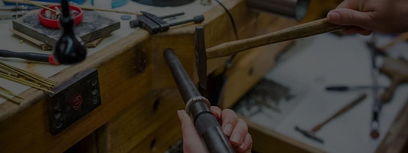
#1: and still champion: very flat constructions that treat metal as if it was cardboard. One of metal's most intriguing characteristics is that it is malleable, and thus can be molded into an infinite range of three-dimensional shapes. That's the great potential of hammer work. Metal can be formed. With the hydraulic press, it can even be formed cheaply in thousands of units. When metal takes on form, light and shadow play across the surface, and it takes on an unmistakable (and seductive ) dimensionality. The cardboard mentality seems to grow from a desire to simply make stuff quickly. The standard solution is to laminate several layers on top of each other, usually as a number of graphic bits floating on a geometric background. Either this approach must be very popular with the buying public, or perhaps it's a manifestation of laziness: easy design married to undemanding craftsmanship.
#2: roll-printing, fusing, and clumsy reticulation as surface texture. The roll-printed screen texture is still very much with us. Texture has replaced polished metal as the default finish for mid-level handmade jewelry, all kinds of torch textures are showing up, too. In many cases, crusty surfaces seem to signify the archaic and the "primitive", as if bogus artifacts were somehow more authentic than jewelry with polished surfaces. Perhaps these jewelers should take a look at German jewelry from the 50's and 60's, to see how texture can be used artfully.
#3: shapes and motifs that hundreds of people use: A). simple forged spirals stuck on other forms; B). flat onglette and shield shapes, both horizontal and vertical; C). big-link chains of squares, triangles, spirals, and zigzags; and D). fish as primal symbols ( replacing doggies ). Use any one of these and you're almost guaranteed mediocrity.
#4: bullet cabachons as pendants. Twenty years ago the tall bullet cabochon was big news. It's not anymore.
Related to #4, there's #5: stones determining design. As stone dealers offer more and more exotic shapes, jewelers try to accommodate their designs to their stock of gems. The problem is that the complex shapes of these stones so dominate the design, that the metalwork appears almost extraneous to the gems. Of course, there's a long history of jewelry designed around great stones, but nowadays it seems that the gem cutters are the designers, and some jewelers are satisfied to construct pretty settings.
#6: a neo-primitive style profoundly influenced by Carolyn Morris Bach, usually consisting of frames of wire posing as sticks lashed together. Actually, Carol Kumata probably did this first in the late 70's, but now it's degenerated into bad neo-primitivism.
It's curious how preciousness has come to be equated with complexity over the past decade. The smooth unity of Scandinavian-modern taste is absent from the American jewelry sensibility. Now, people apparently want lots of detail and texture, as if to prove that their jewelry was actually made by hand. Lots of granulation, appliqué, and unsubtle textures are deployed for precisely this effect. Occasionally, as in the work of Vicki Eisenfeld and Judy Onofrio, over-the-top excessiveness works just fine, but this overabundance usually verges on being disorganized and just plain tasteless.
One fortunate omission from my list: fashionable techniques were absent. For most of the past two decades, one new process after another swept across the American jewelry-metals scene. Electroforming, photo-etching, mokume-gane, coloring titanium and niobium, anodizing aluminum each become the technique-of-the-year, and each is then superseded by a newer tad. Luckily, those fashions seem to have died out, and I can't point to any single overused technique this year.
My judgment in this column presupposes that innovation is more valuable than imitation. This assumption can be debated, and, in fact, I would not claim that innovation is necessary in every context. (For instance, there must be a place in craft for mastery of traditional forms.) Nonetheless, the place for imitation is at the middle and the bottom. Those artists and craftspeople who want to gain acceptance in the middle of the marketplace by making jewelry that looks like everybody else's may want to employ lots of these clichés. But both the artworld and the marketplace demand invention: a continuous supply of the new. Artists and designers who invent distinctive attitudes, techniques, and styles are the ones who succeed. It can be tough at first, because people are often slow to respond to innovation. But in the long run, those who refuse to use clichés and easy solutions get their due. They eventually sell their work at higher prices, or in greater volume, or to a more demanding audience. Using the standard solutions might get you to the middle, but no farther.
Bruce Metcalf works, writes, and teaches occasionally in Philadelphia.
Related Articles

Belle and Roger Kuhn: New Works

Body Art Exhibition

The Intimate Abstractions of Rachelle Thiewes

Metalsmith ’93 Winter: Exhibition Reviews


The All-In-One Jewelry Making Solution At Your Fingertips
When you join the Ganoksin community, you get the tools you need to take your work to the next level.