Gayle Saunders Exhibition
3 Minute Read
Of the various schools of thought about design, "less is more" has been one of the most enduring of the 20th century. Its beginnings were in the reaction against the almost stupifying ostentation used to proclaim society's wealth and power, and almost equally against the shoddy, ill-conceived mass production of the Industrial Revolution.
Gayle Saunders
Helen Drutt Gallery, Philadelphia, PA
October 8-November 5, 1983
It was developed to denote "honest" simplicity and the feeling that "quality" did not automatically necessitate excessive embellishment, or indeed, any embellishment at all. At times, "less is more" conjures up images of drop-dead chic: Halston's "little" black dress; it can also call to mind the domestic interiors at Hill House by Charles Rennie Macintosh.
Whatever the philosophical imperative may be, "less is more" really works best when certain conditions are met: clearly defined goals in line or form; perfect materials whose intrinsic beauty and/or appropriateness is most apparent in an uncomplicated state; exquisite workmanship that promotes the artist's concept and does not hinder the realization of the form or image. It is in the achievement of these goals that resolution of the apparent conflict rests. Gayle Saunder's recent show at the Helen Drutt Gallery addressed a number of these ideas and resolved them successfully with both technical and philosophical integrity in work executed in 1982 and 83.
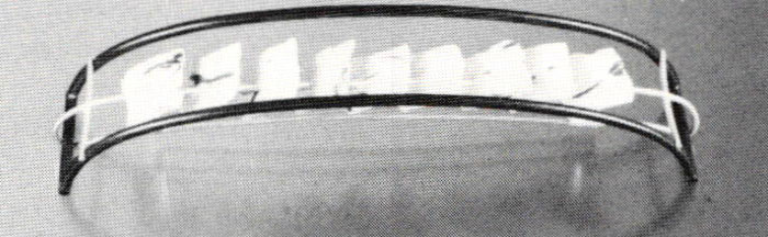
Whether the work was viewed as a whole or individually, it was elegant, original and approachable. The show was comprised of 17 unique and limited-edition pieces—necklaces, brooches, earrings and a bracelet—representing the exploration of one concept. A series of gold panels contained within a strong geometric black steel framework bespoke a concern with contradiction: bright and dark, ragged and hard-edged, random and geometric, gold/soft and steel/hard.
On yellow-gold panels Saunders explored metal with scatterings of colored gold fragments and bits of twisted wire which appeared to have been fused on and then rolled into the background material. The result was never hard-edged or overloaded. The panels with their ragged edges and flecks of color were reminiscent of Autumn leaves. This was studied artlessness. The randomness in juxtaposition to the framing steel's geometry set up a pleasing tension: contrast without disharmony. Grooves cut to accommodate the gold wire support structures helped to integrate the two colors and weights of metal. Although a seemingly minor detail, without these grooves the connection might have been jarring. The very types of metalsmithing employed served to heighten the contrasts and to then resolve them. A pleasing sense of proportion was created by the clarity of solid forms in defined space. There was a feeling of richness without busyness. Although having been refined down to its essential elements, and maintaining a strict Jormat, the work remained the product of human experience and not mere intellectualism.
The show's presentation was also notable. While Saunder's work obviously does not suffer from a lack of ideas, here all pieces were variations on one theme: black geometry with interior panels of goldwork. Whether this was the gallery's or the artist's decision, it was right. The Helen Drutt Gallery exhibits jewelry in a banque of brushed steel and gray velvet wall cases which accommodate large or dramatic pieces, showing them to great advantage. Small or delicate work can sometimes seem overwhelmed in them.
However, here each piece of jewelry was displayed on its own square of handmade paper. The paper's torn edge as well as its internal random scattering of twig and fiber served to reiterate and reinforce the statement already made in gold. The repetition of similar structures enhanced and strengthened the impact of the subject matter. More than just pinning pieces to a wall, there was an actual integration of presentation and subject matter which formed a very effective and successful display. By limiting the range of concepts, by keeping the layout simple and straightforward, by showing each finely wrought piece without "artsy" elaboration, the artist was able to make a more dramatic statement about her work without compromising the subtlety and intimacy of the individual pieces. This almost deceptive simplicity showed to advantage work which was beautiful and rich with meaning.
Related Articles

Metalsmith ’94 Spring: Exhibition Reviews

The Work of Jennifer Trask

A Conversation with Angela Cummings

Erik Stewart – Inspired by the Brooklyn Bridge


The All-In-One Jewelry Making Solution At Your Fingertips
When you join the Ganoksin community, you get the tools you need to take your work to the next level.