Funk Art Jewelry
16 Minute Read
In Objects: USA, the chapter on jewelry bears witness to the hallowed names of modern history. The collective effort of such luminaries as Eikerman, Craver, Fike, Roach, Radakovich, Winston, Renk established a canon for work of the 40s, 50s and much of the 60s. The litany of their works in Objects: USA as late as 1969, reinforced the growing belief in the value of a self-conscious jewelry, reflective of post-WWII American culture.
But 1969 was not a propitious time for the propagation of the faith. American society was facing a challenge from the "counterculture," a new generation bent on finding alternative lifestyles, religious, esthetic and psychic experiences. The work of the modern pioneers exalted in Objects: USA was good artistic jewelry, but dated jewelry nonetheless. It lacked the vernacular of an organic tradition that responds to changing times.
Near the end of the jewelry section, however, was a double-page spread introducing Fred Woell and Ken Cory. Here was work that was obviously made in and of the 60s. It was brash, humorous, raw, "popularly" engaged and engaging. It demanded of jewelry that it become socially relevant at the risk of losing its traditional value.

- Figure 10: Pin, silver, plastic, 2 x 2 x 1″, c. 1967
The New Yorker covered the exhibition of "Objects U.S.A.," and the reviewer's comments were dutifully recorded on the dustjacket of the book: "l felt something almost like national pride as I walked through the exhibition halls and marveled at the beautiful and interesting and insane things my countryman are doing . . . an art-school aura pervades the exhibition, but it's a different kind of art school from any we've known in the past, less earnest and arty, more easy and tolerable of idiosyncrasy."
I had the same reaction upon first seeing Fred Woell's Good Guys pendant of walnut, steel staples with plastic cameos of Dick Tracy and Superman, as well as Ken Cory's pin: a humorous tadpole with serpentine tail of sensuous plexiglass and crude cast-copper. arrowhead imagery. As someone who had come of age in the 60s. I felt these pieces were made for me. I could safely claim my attraction for them without trepidation or guilt that I was accepting the values and associations of jewelry held so dear by my bourgeois elders.
The next time I was struck by Cory's work was around 1972 when I saw the Pencil Bros. Texas piece in the Museum of Contemporary Crafts in New York. Cory had already participated in "Young Americans 1969," "Goldsmiths 70," a solo show at the Museum of Contemporary Crafts, California Design Xl at the Pasadena Art Museum and had begun to work with Les LePere, an "underground" illustrator whom Cory first met at graduate school at Washington State University.

- Pin, copper, plastic, c. 1967
The Texas piece was their signature collaboration, a pencil drawing by LePere rendered in "comix" style with an enameled border and mitered pencil frame by Cory. The diminutive canvas of this piece encapsulated the full range of alternative esthetic values that characterize the Pop and more specifically Funk attitudes in art that reached its apogee during this period: the effrontery of tradition in material handling, the use of borrowed imagery and found materials, the challenge to the pedestal and the frame as the proprietary milieu for artistic presentation, the lowbrow stance of using a pencil drawing as a jewel to be embellished, the embrace of commodities in a world of rarified artworks, the streetwise humor and free-spirited rebellion of a "pedestrian" culture.
It is not surprising that Cory's work has roots in the Funk art movement since he did study ceramics in California at the time of Funk's inception. Funk art achieved its greatest expression and brought significant notoriety to craft media through the efforts of Robert Arneson and his students at UC Davis. Like Pop art, its progenitor. Funk was anti-establishment and popularly based. Unlike Pop, it deliberately set out to create art of questionable taste. It was California's answer to and rebellion against the hegemony of the New York art market. As Garth Clark has noted. "Whereas Pop art drew its aesthetic from a commercial craft form of poster-advertising art. Funk drew from what might be termed consumer craft." Although short-lived (late 60s to early 70s), Funk art attempted to build on the intrinsic social values of popular art but also to extend a suitability of forms to neglected media like illustration and craft.
At that time, Funk art became the van guard of the counterculture's intrusion into the fine art world, while political jewelry and ethnic body adornment became the focal point of the counterculture's uniform. It seemed that the youth ghettos of every major West Coast city from Seattle to San Diego were crowded with itinerant vendors selling the visual street language of peace symbols, tie-dyed t-shirts, headbands, beads and black-lite posters, a micromarket of alternative commodities that symbolized the counterculture's binding ideologies.
Funk's contribution was one essentially of attitude. It was one of context rather than form. At issue was the reaction evoked by the object that penetrated the viewer's preconceived notion of art. Funk was a tactic borrowed from Dada directed against the cool, mannered approach of Pop and the moral tone of Abstract Expressionism. The name funk, as duly noted by Garth Clark, was taken from the term "bagless funk" describing "the musk smell of a woman's groin." "What is felt is real and tangible, what is thought to be distrusted. The residue or the by product is more interesting and provocative than the intellectual process that creates it. In essence, 'It's a groove to stick your finger down your throat and see what comes up,' this is funk."
While Funk art quickly dissipated, returning in transmuted forms throughout craft media, from kitsch to neo-mannerism and tromp l'oeil, the nihilistic attitude toward high-brow art remained a persistent force in broad-based hippie ethos—a reformation through banal normality. In contrast to Pop artists using comic strips and billboards in their work, in a sense transforming them into art, Cory took these "proletarian-graphics"-made-art and brought them back to popular sanity, retaining the esthetic effects of art but shedding along the way the pretentions of the art world.
Funk artists loved the plastic qualities of pure pictorial order. For example, in ceramics glaze colors used were of the hobby-store variety, construction was sloppy expressing the undeniable disdain for preconceived design, while images were often verbal/visual puns, evidence of intuitive perception. Throughout his Pencil Bros. period, Cory maintained a formal empathy with his ceramic counterparts. In his jewelry, the hobby-store glazes were translated into garish "Pop" enamels, an almost irreverent use of delicate medium, a slanderous attempt to handle the materials like flat lithography. Cory's enamels complementing LePere's illustrations create a vibrating surface of chaotic color, an effect similar to that of a Peter Max poster. Both the Funk ceramists and Cory maintained a reference to a commonplace reality, Arneson with his typewriters and toasters and Cory with his pins and buckles. However, their material handling manifests a stronger iconoclastic gesture toward the popular, resulting in works that border on the banal—the kitsch.
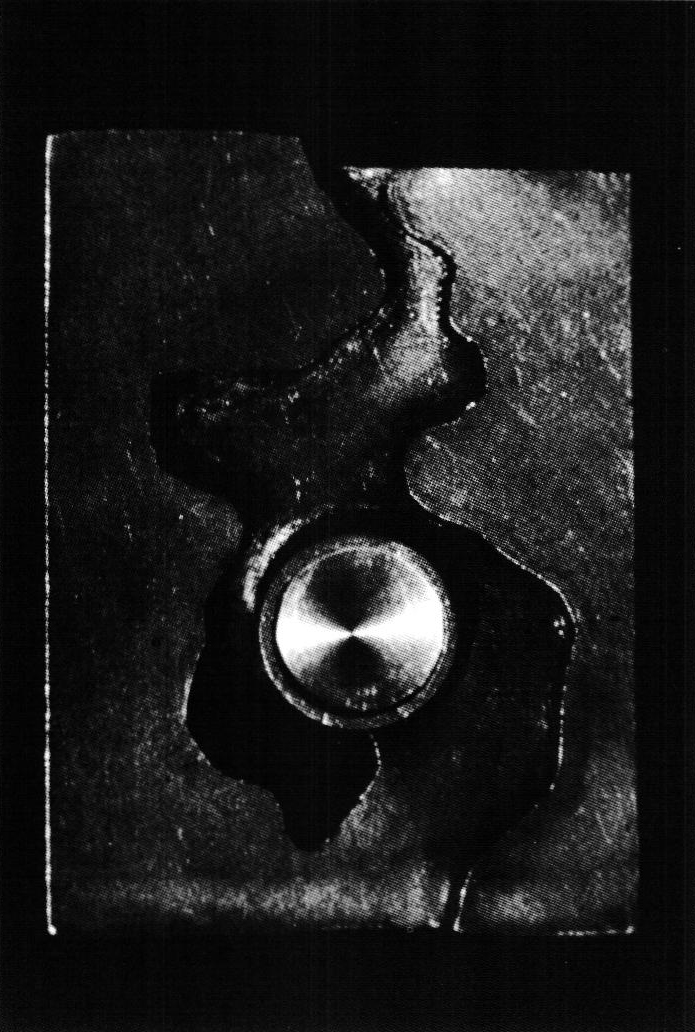
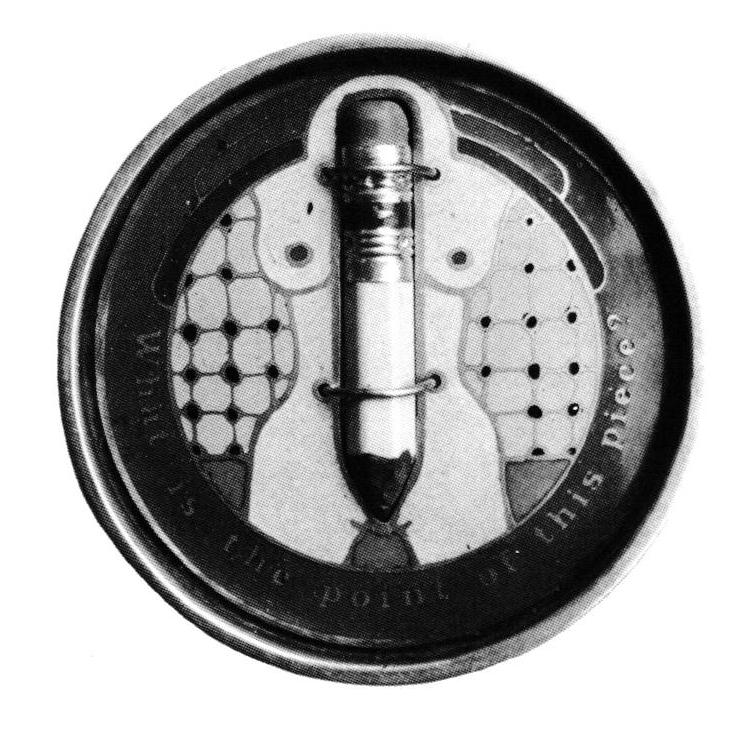
The use of heavy-handed verbal/visual puns so rampant in Funk sculpture can be seen in Cory's Pencil Bros. buckle of 1974 called What is the point of this piece? (figure 2). The round frame serves as a target riveting our attention to the bull's eye (or the bull's target), which is a frontal female nude. Affixed to the surface is a pencil nub, an arrow that has found its target, the bull's eye of the erogenous zone. This piece is blatantly vulgar, crass in composition and raw in its insensitive imagery. The comic portrayal of the female body, the phallic symbol of the pencil, the moniker of the Pencil Bros. . . . mightier than the sword, mightier than the . . . can be viewed as offensive and pornographic in the current climate of feminist issues.
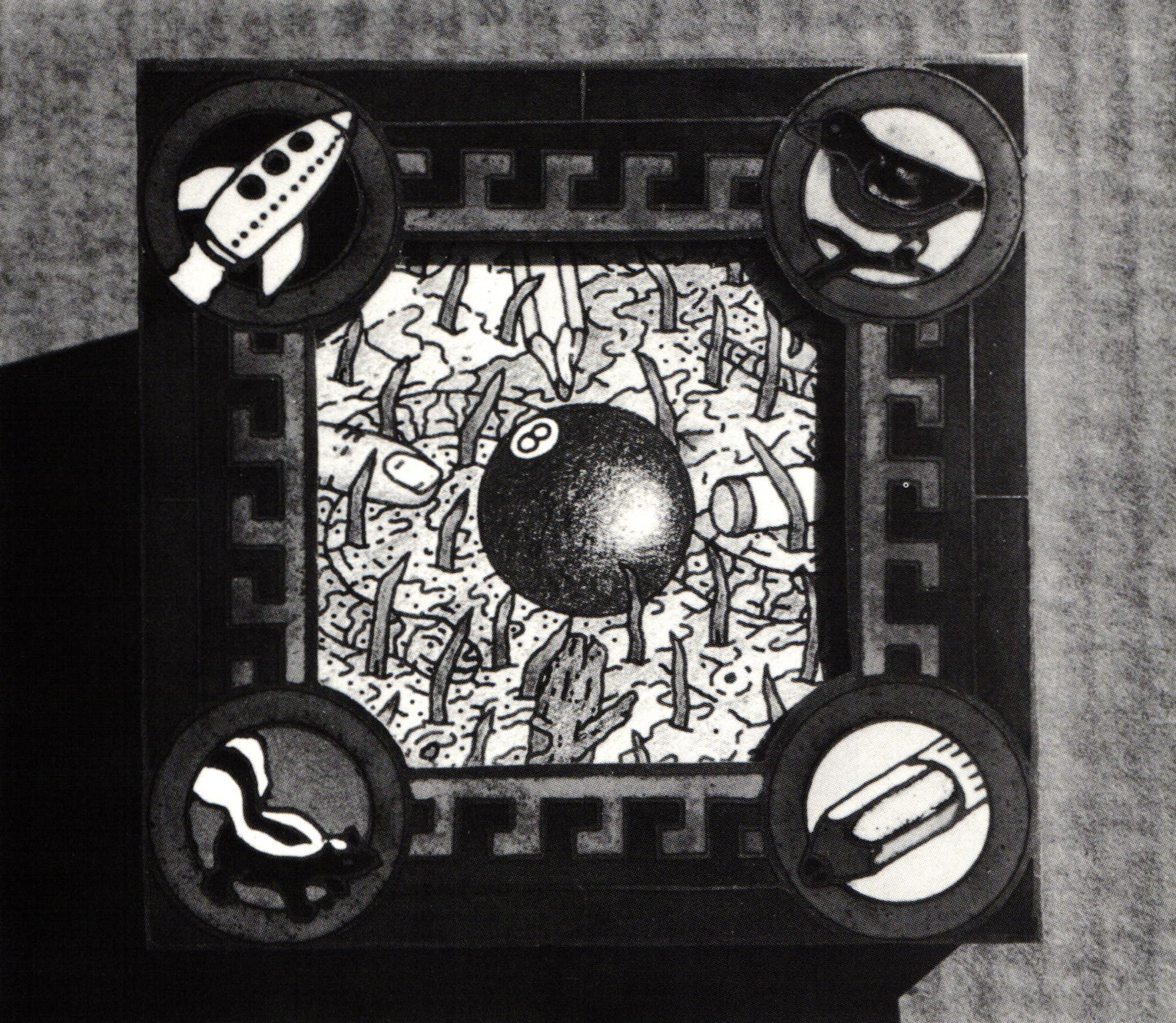
But in the historical context of 1972, the use of pornography or sexual an was seen as a liberating device to free society's repressed emotions and prejudices. That was the point of funk. Put your finger down your throat and see what comes up. It was intuitive, without responsibility or inhibition. It showed the worst art side-by-side with the best. Cory apparently liked it that way. In fact, the little cameos that adorn Cory's frames (figure 3), reminiscent of Woell's comic strip heros, seem to be fleeting images that crossed Cory's mind at the time of making; the spaceships, stars, hearts, skunks are the heros of Cory's subconscious. They are there for no other reason than that Cory liked them. They are in the same instance decorative and primal in his self-reflective iconography. They are the preemptive signs of the artist's free choice.
On two points Cory's work differs from his Funk counterparts: the concern for function and careful workmanship. Cory makes jewelry and in doing so avoids the pitfalls of sculpture. The ceramists were determined to remain outside the established art world, estranged from institutional control by making work of questionable taste and decorum. But because their work was oriented toward the pedestal and recognizable as sculpture, whether in the Dada or Surrealist tradition, they eventually became assimilated into the gallery scene and the cannons of critical history. as have other subversive movements before them.
The ceramists used commodities as referents to their art; Cory used art in his commodities. Cory made belt buckles because he said they can be used to hold the pants up as well as to facilitate their removal. By designing such work that can be democratically circulated in the marketplace rather than the rarified atmosphere of the gallery, encoded by the stringent paradigm of art critics, Cory asks to bejudged by the populace rather than the cognescenti, a condition proscribed for non-art.
Consequently, Cory's emphasis on craftsmanship eschews the use of gesture as a polemical strategy. The ceramists, whose skill was undeniable, were determined to make work that was sloppy and repulsive, although many did later relinquish this tactic in favor of polemic imagery. Their work was viewed eventually as an iconoclastic conceit contrived to reflect their disdain for the intractable posture of the an world vis-a-vis the craft medium. Cory, on the other hand, appeared free to enjoy the amorous interaction with his work in process. He made it because he liked it and thus summoned the inherent desire to be naïve—another basic criteria for non-art. He did not create his work to debunk myths of the art world but to reaffirm the alternative experience of commonplace, handmade objects of artistic value.
A word or two must be said about the illustrations of this period. For the most part they were inspired by and often rendered by Les LePere. LePere was a painting student when he met Cory at WSU. He had also been doing cartoons and illustrations for a Seattle underground paper under the nom de plume "The Pencil," hence the Pencil Bros. The style of LePere's illustrations was that of the "comix" (Zap, R. Crumb, S. Clay Wilson, etc.), proletarian alternatives to mass culture that dealt with cliché situations of a decadent society. They looked back to the work of Harvey Kurtzman at Mad and forward to Art Spiegelman's RAW.
Cory's "framing" of LePere's illustrations as jewelry was problematic in its relationship with painting or two-dimensional art. By maintaining the integrity of the picture plane, in setting them within a frame, Cory appears to question the traditional role of the jeweler who subordinates his work to the enhancement of the esthetic content of the gemstone. The question persists: Is the heart and soul of the pin Cory's framing or LePere's illustrations? Their composition, strictly two-dimensional, frontal, square and framed, rendered in pencil and ink with figurative imagery, carries the nominal weight of painting. In these collaborative pieces, Cory plays with our perceptions and especially our preconceived notions of an and jewelry while maintaining a respect for the artist's work and an honest love of jewelry's function as an ornament.

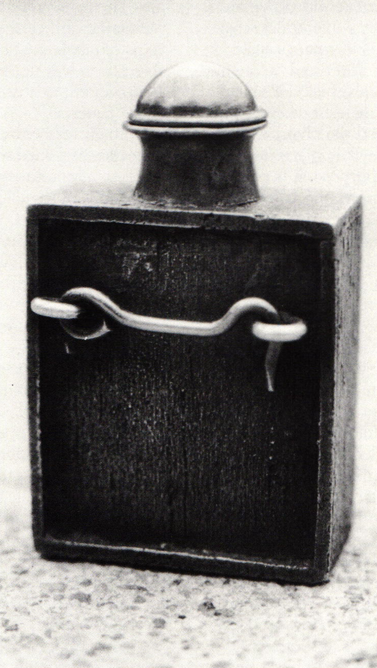
- Brick Breast Bottle, back
In tracing Cory's roots back from Funk to Pop art influences, it is instructive to compare his work with that of Woell, both progenitors of pop jewelry. Pop was a hybrid of two abstraction-dominated decades and as such is the heir to an abstract rather than a figurative tradition. As Lucy Lippard has said: "This unexpected outcome of a decade of Abstract Expressionism was hardly welcome since it dashed hopes for the rise of a new humanism. Man might make an occasional appearance in Pop canvases but only as a robot remotely controlled by the Consumers Index or as a sentimentalized parody of the ideal." In his Good Guys pendant,
Woell employed an anything-goes attitude towards materials and subject matter, destroying barriers of self-consciousness and self-importance, working, as Cage and Rauschenberg professed, "in the gap between life and art," or, as Lippard claims, as a sentimentalized parody of the ideal. In straddling the chasm between life and art, Woell was "hotly" engaged, throwing back to society the sterile images of its debauched culture. Cory, on the other hand, chose to work in the clean, neat, detached, classical stream of commercial iconography. He was "cooly" removed from any sentiment or therapeutic impulse. Like LePere's illustrations,
Cory's imagery seems to be robotically controlled by the cliché situations he found in contemporary society. His strategy was not one of parody but of a romantic mimicry, a comic fantasy outside of life and art rather than between them. Like LePere's illustrations, the relevance of Cory's pins depends on the context of the situation in which they are perceived (or worn) rather than in the empathy with the narrative.
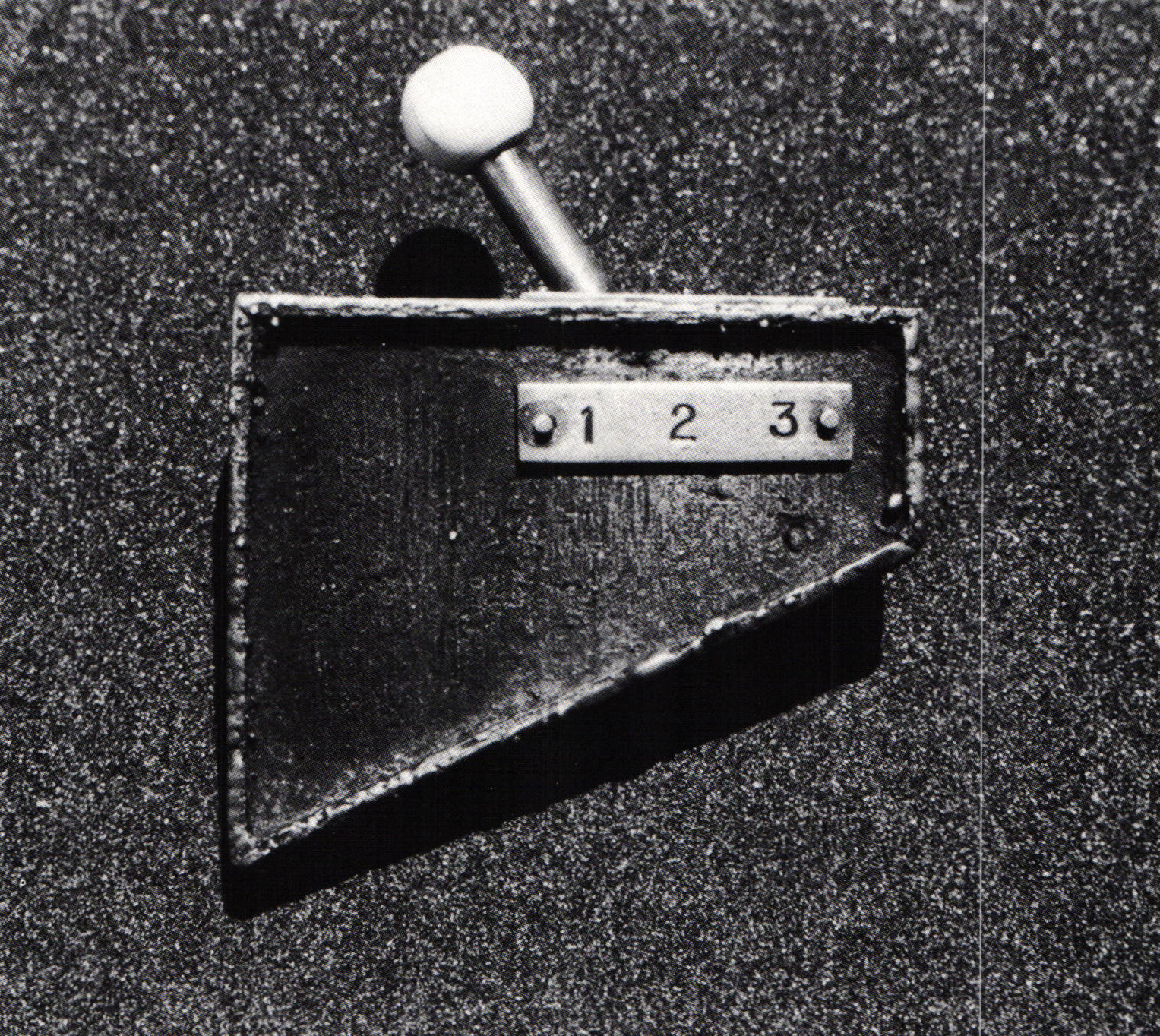
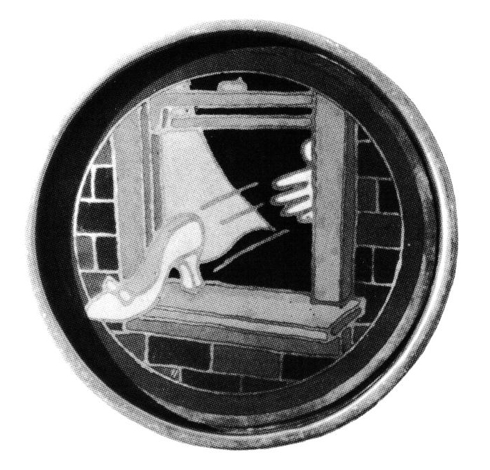
In this way, by playing with the perceptual techniques of "cool" Pop and the seductive materiality of his craft, Cory was able to create objects of concrete reality without the lure of artistic interpretation. In the earlier "gear shift" pin of 1969 (figure 5), Cory isolated an apparent fragment and presented it close-up through jewelry's inferential scale. The ambivalence of this fragment's scale gives it a personality it never had before and in this way it becomes a vehicle for an entirely new lyric and plastic power. Cory successfully anesthetized the object without rendering it illusionary. This piece is without hints as to context or purpose. It is cold and clinical, without ambiguity, nevertheless arbitrary in representation.
Cory's intense fascination with the plastic power of his materials is made clear in these fabricated abstractions. The themes throughout Cory's work are consistent and reflective of the counterculture's" then preoccupation with sex, ecology, humor, play and satire. The often-published 1967 pin of silver, leather and stone (figure 6) is a fixed image of the period with its proverbial tongue dangling in playful defiance yet ironically seductive in its tactical surface.
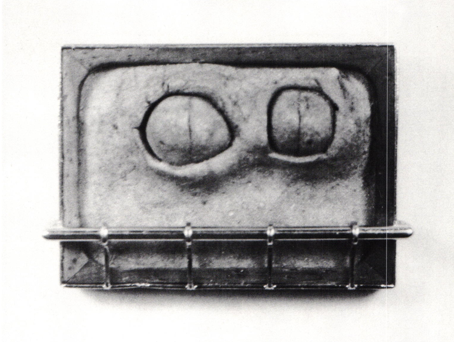
The droll references to nature, running the gamut from decaying barns to slithering serpents, recur time and again, transformed by Cory's intuitive handling of discordant materials like copper and plastic into disarming portraits and landscapes—like the stare of the humorous "owl" eyes of his 1968 ceramic and rosewood (portrait?) pin (figure 7) that strip us of our pretensions and our vanity. But these themes are not the subject matter of Cory's pieces; they are the situations that contrive the action of the material.
Cory wants us to engage the material as the communicative vehicle of his craft. He wants us to strip bare our superficial attraction for facile narrative and release our subconscious attraction for pure plasticity, the visual and tactile properties of the object. When Cory began to cast copper (by melting down pennies), he recovered the visual rewards of a weathered and earthy process—the "mined" veins of tactile memories. Cory's use of abstraction was not meant to abstract representation but to abstract the plastic attributes of the material.

- Figure 8: Brick Breast Bottle, copper, brass, silver, enamel, 1¼ x 1 x 2″, 1971
In the brick breast bottles (figure 8), with their blatant sexual references, there appears to be no attempt to add anything new to our knowledge of sexuality. Rather, the utilitarian nature of the object, forcing us to feel and use it, calls attention to how it is made and what it is made of. Although Cory's method is devious, suggesting a vicarious thrill in fondling a nipple in the guise of opening the boule, he apparently believes that material sensuality cannot be approached directly. Because we have been inured by the historical associations of materials like silver and gold, we have to be seduced to appreciate the qualities of copper and brass.
Cory's investigation into plastic follows that of copper—abstracting the metaphoric as well as the physical "plastic" essence of debased materials. Plastic has become ubiquitous not only because of its formal properties of translucency and color but also because it is a material that has no history in art. It is a contemporary material that has been associated with industry and technology rather than fine art or jewelry.
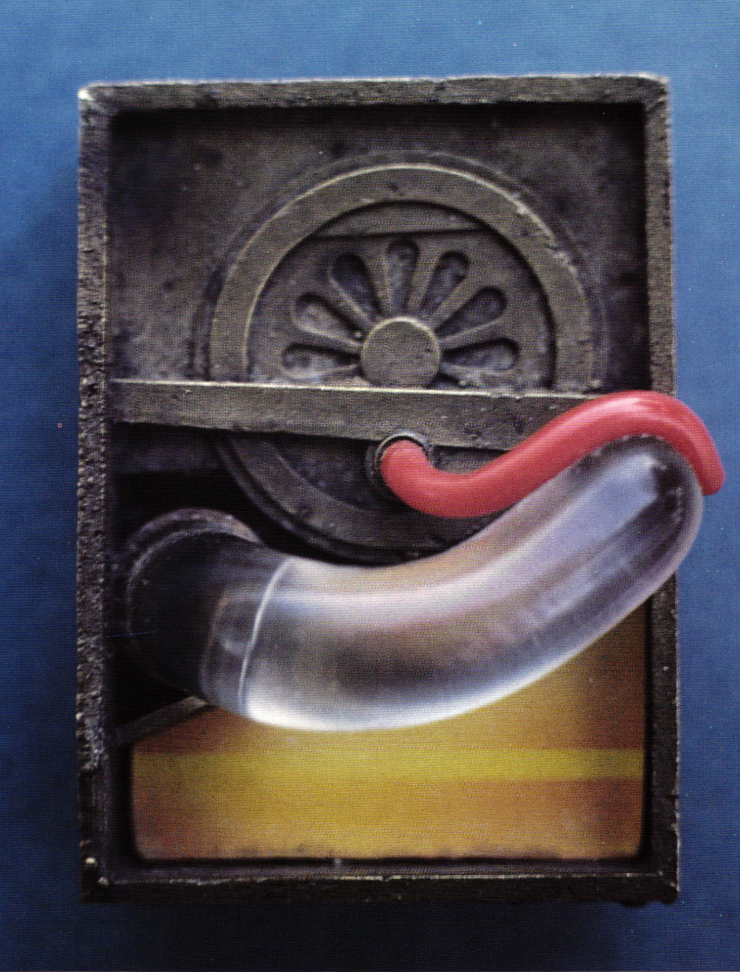
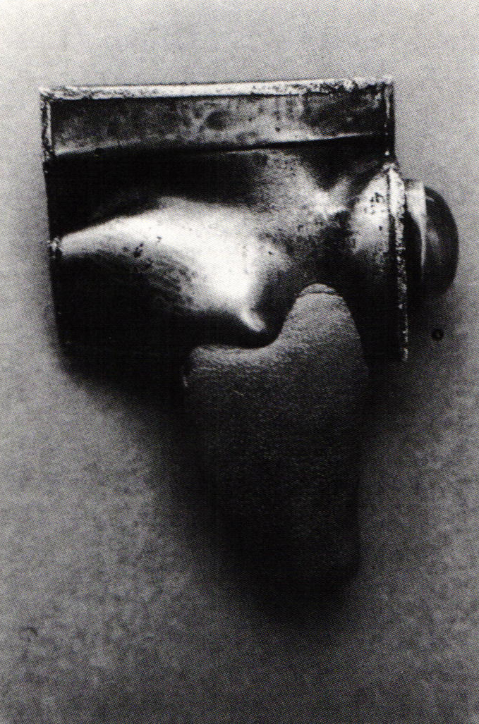
Although many other practitioners have explored with greater success the formal properties of the material, Cory remains unchallenged as an exponent of its suggestive qualities. In the brass and plastic pin of 1968 (figure 9), Cory uses his familiar technique of a hard, inorganic, industrial ground (brass), rendered in a faintly anthropomorphic composition. Protruding from the rosette face is a delicate, sensuous red plastic tongue that slithers forth to caress a translucent lozenge. Although we are amused by the anthropomorphic references, what is at work is plastic acting like plastic. The elements seem to be oozing of their own accord, doing a little mating dance right before our eyes.
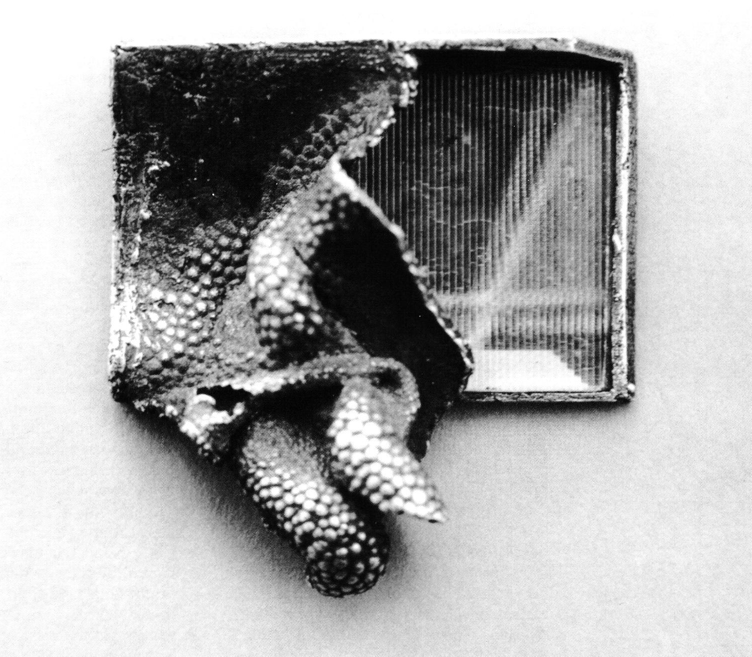
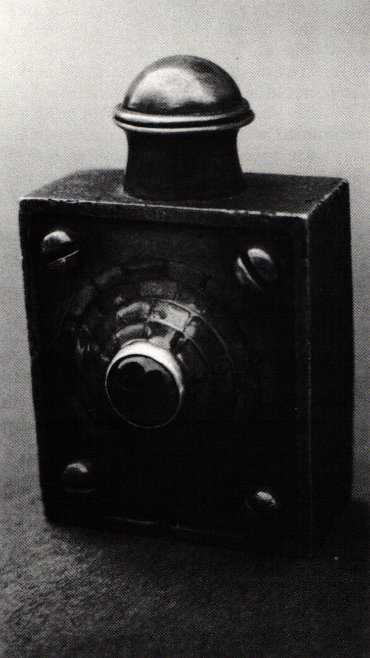
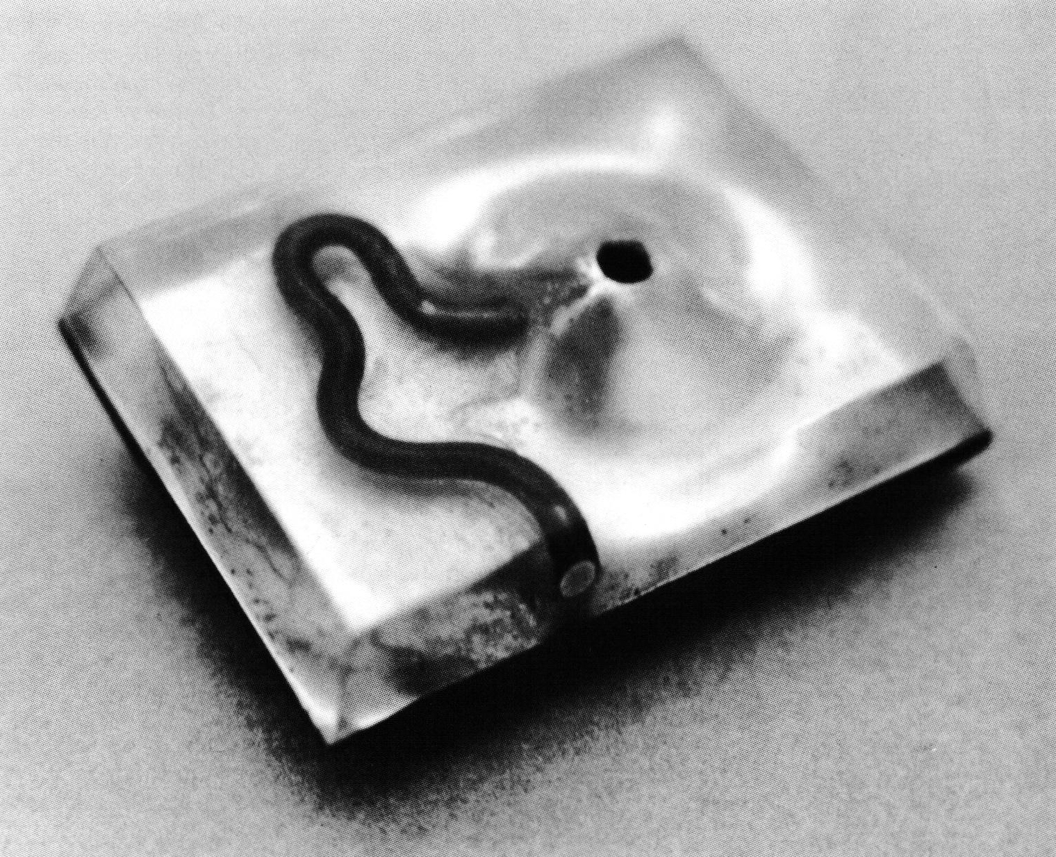
Cory's pin is a candid photo of an inorganic material acting organically. The mystery of plastic as a material had a hold on Cory's generation just its gemstones had on his predecessors. Already Cory had spotlighted this element of mystery in an earlier 1967 pin (figure 10), where a silver cast sheathing is being torn away to reveal the plastic soul within, and in a 1968 pin (figure 11), where his signature snakelike form is swimming within a landscape of plastic that renders perspective simultaneously real and illusory, very much like glass artists use the translucent property of their medium.

- Figure 11: Pin, copper, plastic, 1½ x 1 x 1½", 1968
Cory diverts the viewer's attention away from any recognizable theme or representational security with the sudden discovery of a "plastic" medium. He ignores the artist's mandate to transcend material and technique in favor of a truncated process where material confronts handling, where the artist respects the intrinsic life of the material and accepts it as an equal partner. He does not control it but cooperates with it. Consequently, the expressive qualities of Cory's pins cannot be clearly attributed solely to him or to the organic vitality of the medium. By establishing this ambiguity, Cory makes work that remains intractably plastic and effects a nihilistic seduction that takes more than it gives. It's like sticking your finger down the throat of the material to see what comes up.
Notes:
- Garth Clark, Margie Hughto, A Century of Ceramics in the United States, 1878-1978 (New York: Dutton, 1979), p. 162
- Harold Paris, "Sweet Land of Funk," quoted in Clark and Hughto, p. 159
- Lucy Lippard, Pop Art (New York: Praeger, 1966), p. 9
Michael Dunas writes on craft, art and design.
Related Articles

The Jewelry of Thomas Mann

The Work of John Marshall

A Metalsmith’s Guide to Rome

Pocket Watch in the Year 2025


The All-In-One Jewelry Making Solution At Your Fingertips
When you join the Ganoksin community, you get the tools you need to take your work to the next level.