Helen Shirk: Patterns of Growth
11 Minute Read
Last fall, the National Ornamental Metal Museum in Memphis, Tennessee hosted a retrospective of the work of Helen Shirk. Nearly 70 pieces, from her early silver work in the late 1960s, to her recent patinated copper and brass vessels, confirmed her substantial contribution to the world of metalsmithing.
Helen Shirk has spent two decades on a voyage through metal. A series of transitions in scale, approach and materials marks her course. An increasing use of color and design of movement, most evident in her recent work, provides the scope. Her three-dimensional orientation defines the focus.
As an undergraduate at Skidmore College in upstate New York, Helen Shirk studied metalsmithing and painting with Earl Pardon. In 1963, with Pardon's encouragement, she obtained a Fulbright Scholarship to study at Kunsthaandvaerskolen in Copenhagen, Denmark. While in Europe, Shirk decided to continue her metal studies in graduate school. She remembers that "there was a student there, a business major, who said, 'You know they just built a big new art building in Indiana. It must have something in it.' So I wrote them. Alma Eikerman sent a really positive response to my letter, because she had also studied in Denmark. Indiana accepted graduate students in January, and that's when I wanted to start. It was a coincidence that I ended up there. I'm forever glad."
When she arrived at Indiana University in 1967, Helen Shirk had been away from the American academic atmosphere for four years. On her first day at Indiana, she got off the elevator on the second floor of the art building, in front of the jewelry display case, which was brimming with pieces conceptually and technically different from anything she had ever encountered. Unlike the work at Skidmore, which dealt primarily with construction, and her own work, which was limited to two dimensions, these pieces were three-dimensional and formed. This was Shirk's introduction to the world of Alma Eikerman. "Alma had an influence on everybody there," Shirk says. "She was obviously so committed to what she believed in, and had such a passion about it. There was a I.U. style, and when Alma retired, it didn't go away. To me, it had to do with the way parts came together, and with transition done in a three-dimensional way. Because of the three-dimensional approach, the work that came out of I.U. always had a structural, architectural feeling."
At Indiana, Helen Shirk developed her own three-dimensional sense of working metal, an integration of spaces, planes, sculptural components and linear elements that continues to inform her distinctive style. This three-dimensional approach would also prove to be the common thread as she moved from silver holloware and jewelry to silver and titanium brooches, and then to copper and brass vessels.
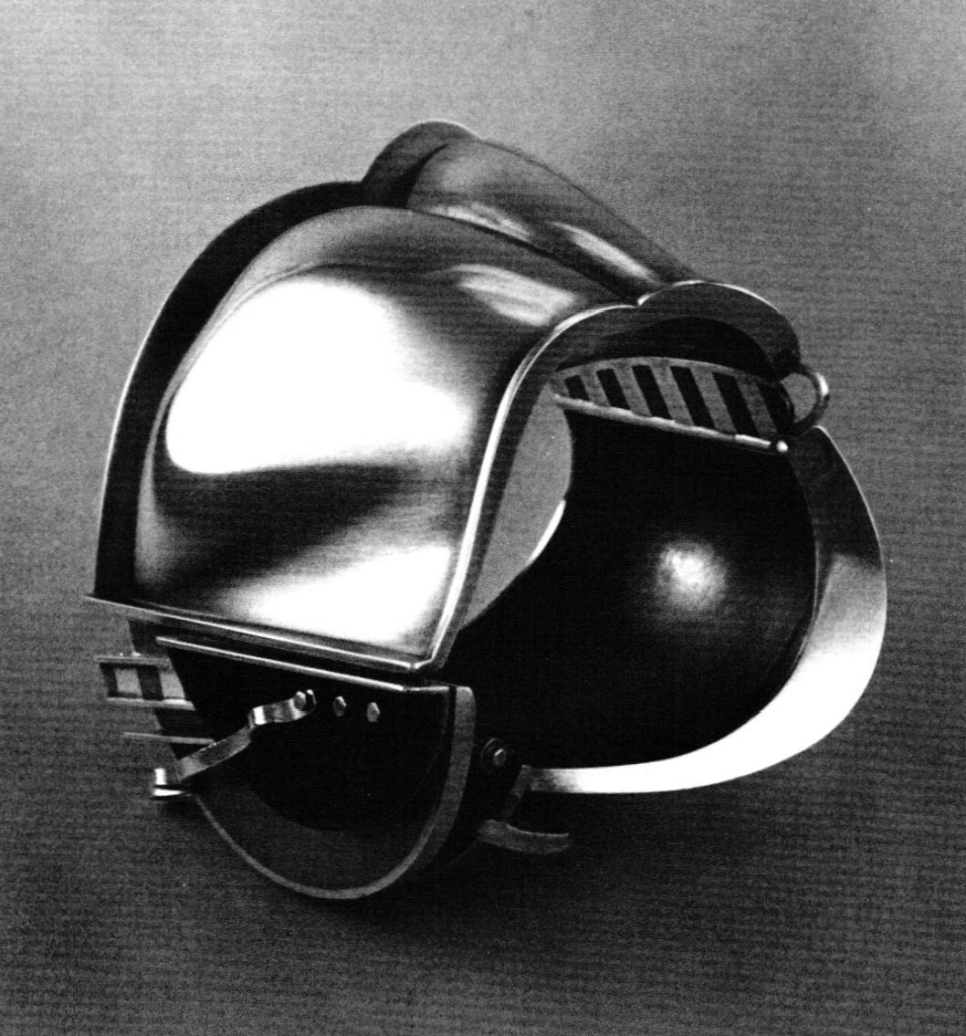
During the 10 years following graduate school, Helen Shirk started teaching as an assistant professor at Indiana University. In 1975, she began her long-term alliance with Southern California as Professor of Art at San Diego State University where she continued to expand and refine the three-dimensional concepts engendered by Indiana. Her works during this decade were diverse, organic and increasingly complex in form. Formed and fabricated silver took the shape of holloware, hand mirrors, boxes, cups, all technically oriented, with an austere beauty, as if an exercise of the intellect.
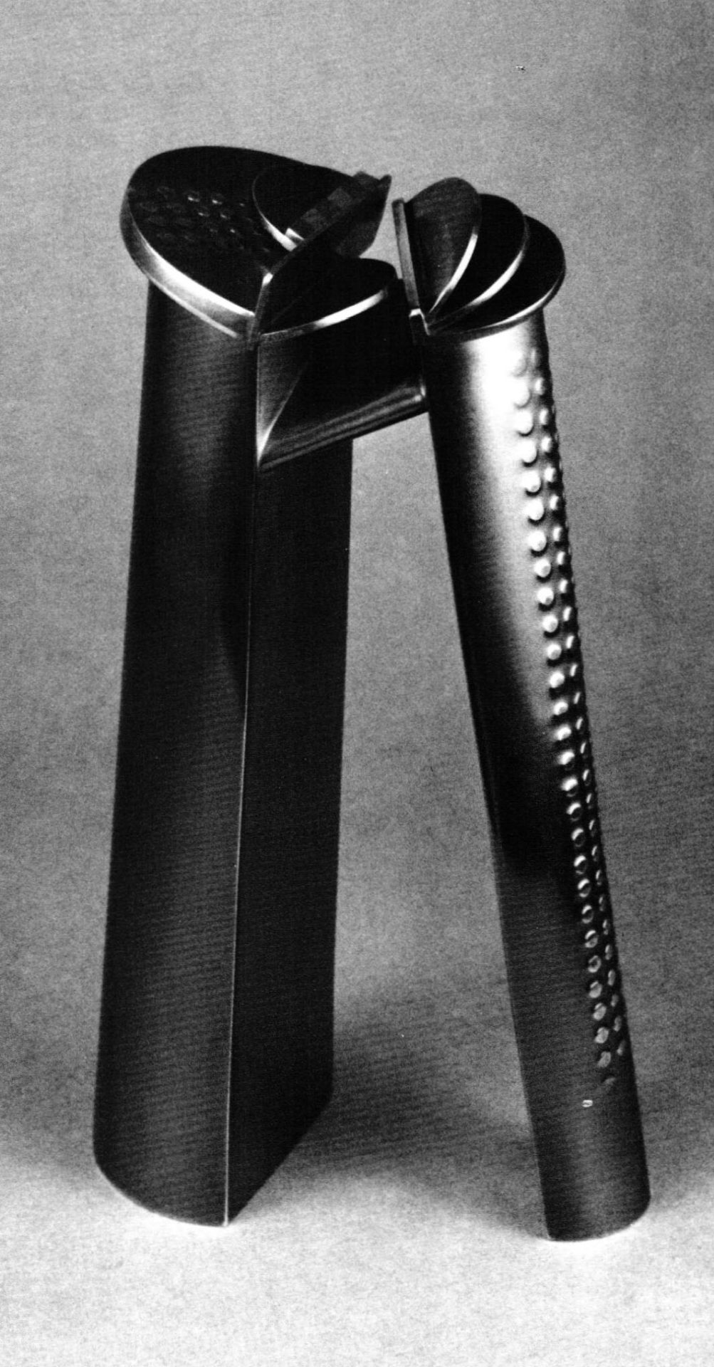
In Lidded Container (1979), Helen Shirk addressed function with a strong visual form, characteristic of this period. The sculptural quality of the seven-inch form is heightened by a highly polished silver surface. The energy of the form rises to the top, where it flares into a flattened mushroom shape. Smoothly sloping planes on the lid are broken by the addition of seven copper bars, creating pattern on the hard edge. A copper wedge ascends the length of the work, accenting the asymmetrical shape and contrasting with the fluid, rounded surface of the base.
From 1970 to 1980, Helen Shirk went in and out of jewelry, often selecting the bracelet format because it allows freedom to work sculpturally, around the space of the wrist. In contrast to her organic, almost voluptuous holloware forms, Shirk's jewelry tended to be angular and linear, erupting in complex compositions of intersecting planes. Also, her bracelets, collars and pendants began to incorporate new materials: hemarite, delrin, onyx, tourmaline, mother-of-pearl.
In 1980, Helen Shirk made an unexpected turn in her career, the first in a series of transitions. The catalyst was Edward DeLarge, a British jeweler known for his innovations with titanium, who shared a studio with and would soon marry Shirk. At that time, Shirk's work was elaborate and often belabored, in danger of drifting into excess. "Edward made me look at my work much more critically," she says. "I had reached a kind of outer point where you retrench and go way back to find a nice play between refining and simplifying."
Helen Shirk began to examine what was crucial in each piece, to find the essence of what she wanted to do. She created a silver and copper brooch, titled SB2 (1980), using half-tubular sections. Although she had experimented with tubular compositions in previous pieces, notably Black Box (1979), this brooch was designed with a black-and-white mental image to eliminate extraneous elements. The linear focus of the piece gave it a much simpler form than the sometimes overdone bracelets of the year before. Her work had a freer look, with immediacy obtained through simplification.
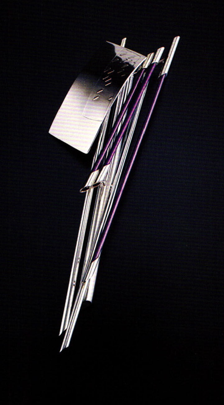
Shirk's previous work had been that of a purist, focused on form, to the exclusion of all else. DeLarge led her to color with the lure of titanium. Her brooch TB1KN (1981) marked the first of a succession of silver, gold and titanium jewelry pieces that investigated space and linear movement as thin, colored lines of titanium rods determined the cool, spare look of the pieces. In brooch TB9TRA (1982), a colored wand of titanium has been coaxed into a bowed arch, balanced by three silver tubes that suggest they have gently fallen in a game of pick-up-sticks. The design is intersected by a fifth rod, which undulates over the piece, extending over the outer edge. The result is a focus on color and line, with a subtly retained three-dimensional quality.
The pieces were tumbled to create a mirrored finish, which heightened the feeling of weightlessness, like a quick flash of light in space. Many of the brooches and a series of bracelets were developed as collages, with gently curved, roller-patterned surface elements, anchored by colored rods suspended over each other. Someone once asked if he could pick up one of the pieces, commenting, "I thought maybe it wasn't all together." "That's just what I wanted people to feel," Helen Shirk says, "that this was just a freeze-frame of something in constant movement, that these were on their way to different positions and this was just one frozen moment." This series would continue for two years and prove to be her breakthrough into color and movement.
During a sabbatical as artist-in-residence at England's Sir John Cass School of Art in 1983, Helen Shirk decided to return once more to the vessel form. "I had been doing jewelry exclusively for the last four years, and although I liked the work I had done, I felt I had reached the end of a series. The vessel came to mind, in part because this was something I had dealt with in the past, and also because I had been looking at historical and contemporary British ceramics."
The vessel format would allow her to explore a large-scale, three-dimensional arena, free in space. "I began in a simple, direct way, cutting paper," she says. "The paper forms were very contained and symmetrical, characteristics that are not normally part of my vocabulary…I wanted them to be looser and integrate more space, but finally decided that this contained phase was something I had to go through first." The vessel also seemed a more intimate format to her, in part because of the role it has played in man's history, but primarily because it allowed what she calls "a private conversation between me and the object." This is in contrast to jewelry, which she feels involves the wearer as a third party. The wearer injects an impersonal element into the creative process. The making of vessels does not include the demands of an imaginary intruder.
Helen Shirk chose copper and brass for her materials. Patination would provide the color. Michael Rowe had just authored The Coloring, Bronzing and Patination of Metals, and Shirk talked with him in London and studied patinated pieces on exhibit at the Crafts Council Gallery. The element of unpredictability in patinated surfaces, and the surprising results she was achieving encouraged her.
In May, 1983, Helen Shirk became a mother. "I was introduced to a life with a child, which makes you a child again. I felt incredibly powerful. It gave me access to things I'd put away a long time ago. Now my work is about things that are closer to me."
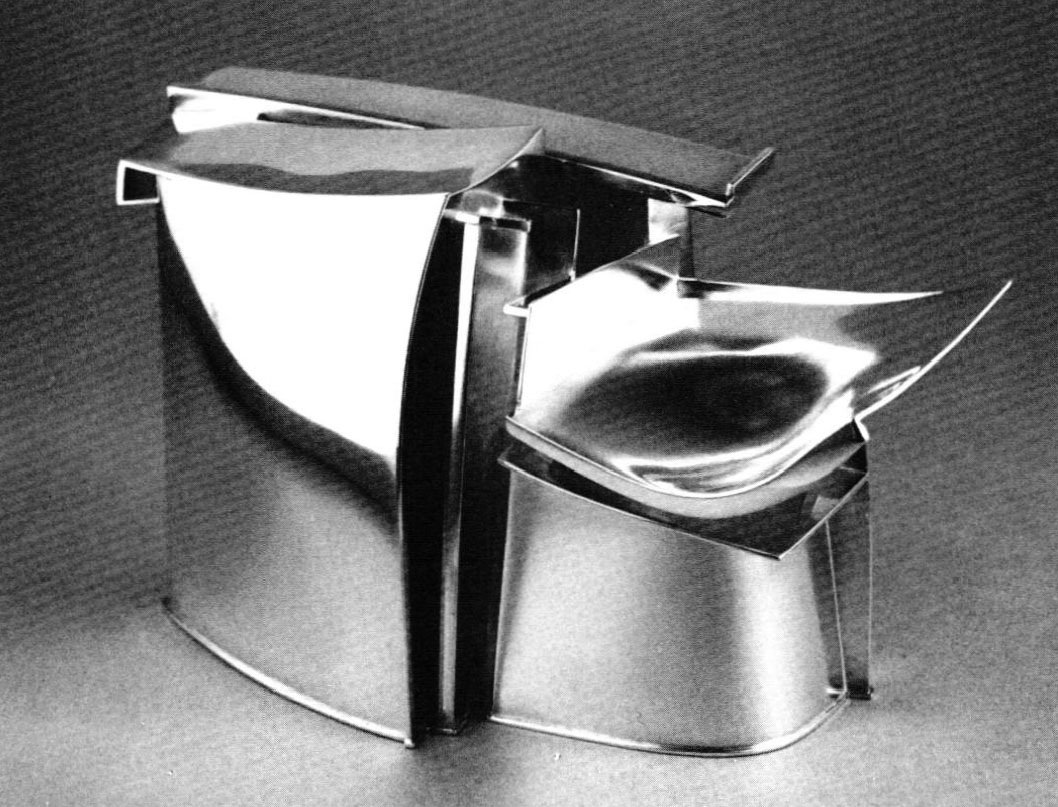
Helen Shirk and DeLarge returned to California with their one-month- old son. She had already determined to work in large-scale vessels with patinated copper and brass. She now decided to explore designs that eliminated soldering. Some requirements came from the forms themselves. Soldering softened the hardness of the metal, with the sharp points in her designs especially vulnerable. It also chemically restricted the use of some patinas. Shirk's own time limitations, now constrained with an infant and her return to teaching at San Diego State, dictated that she eliminate the extra technical steps that soldering would require. Layering and riveting into three-dimensional forms became the solution.
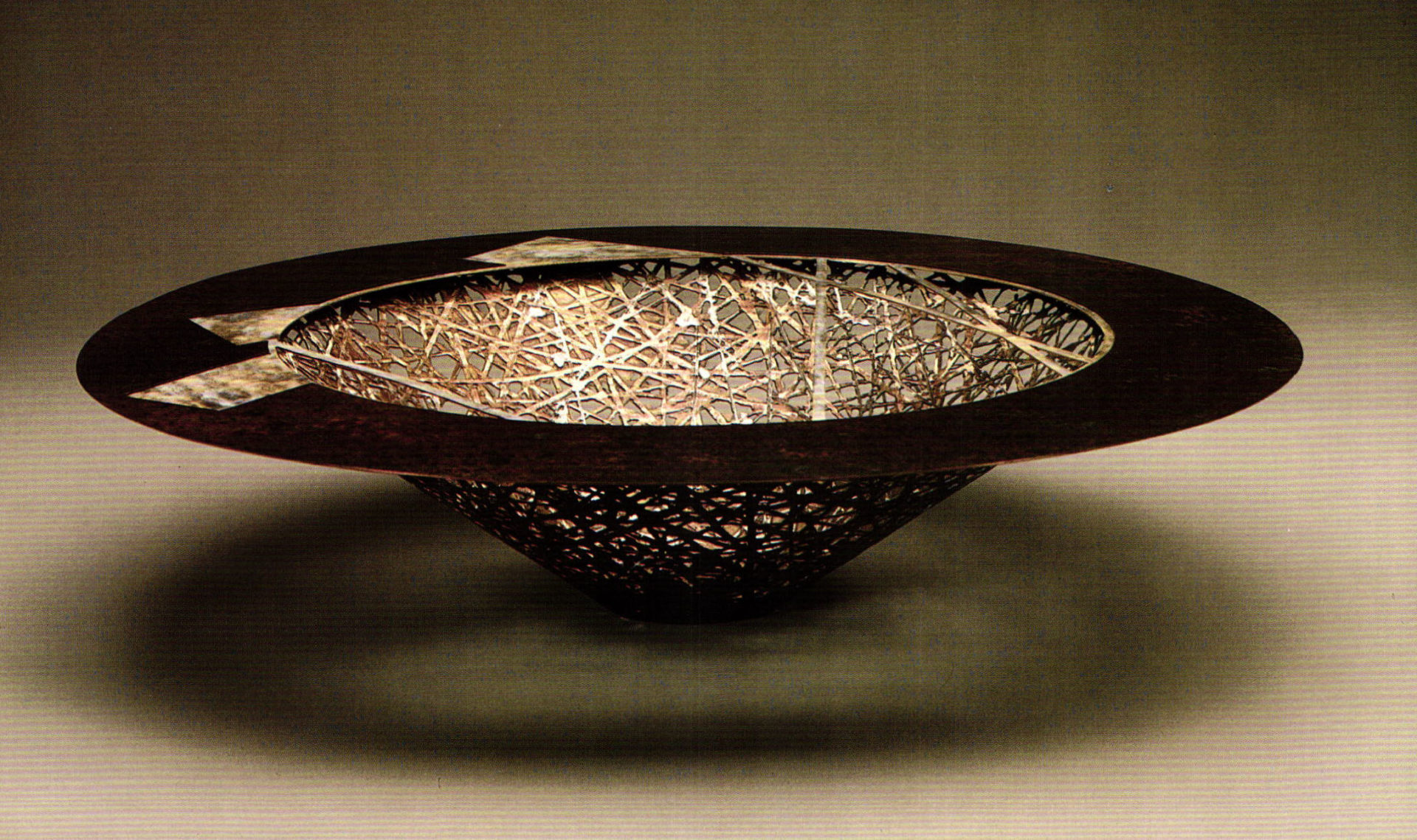
Her initial vessels were still restrained, articulated in the rather tight, circular format she had devised in England. Then Shirks work began to soar. Inspired by her return to the desert landscape of Southern California, her vessels evoked the natural vegetation of her environment, spiking to a size of two feet or more. A loosening and widening of the forms, combined with layering, fabrication and patination, added a sophisticated allusion to the expansiveness of the Southwest. "Support System" Vessel CV285 (1986) revealed superimposed riveted strips of black patinated copper, slightly angled in a horizontal, overlapping pattern. The predominantly black color, plus large scale (7″ x 25″ x 11″), gave the work a strong emotional impact. Two triangular areas embellished with oil pastel added a punch of color and feeling of solidity to the total shape.
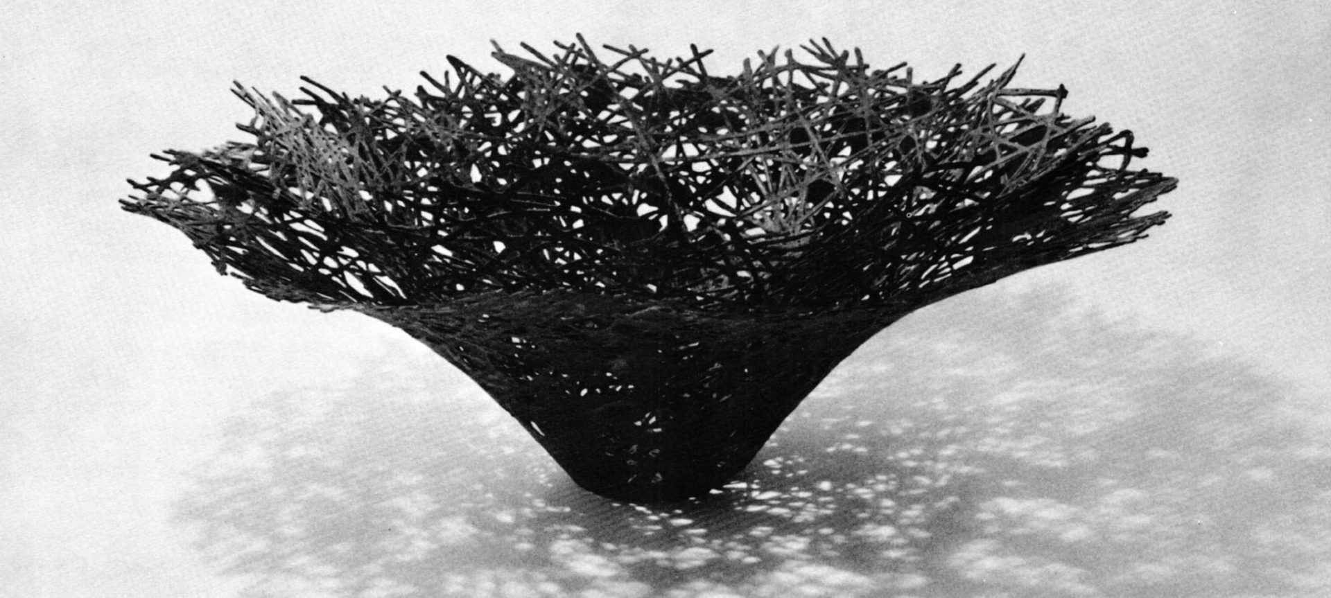
The bird-of-paradise plants in Shirk's yard, sprayed black, then sketched and photographed, also served as a point of departure for this, her most controversial series. Jagged, pointed leaf-shapes sprang forward from the works, creating energy and strength. Softly dappled patinated areas were patterned against sections of mysterious black. The sculptural forms coiled then released, alternately enclosing the layers, then penetrating into space. The central core of the vessels remained concave, as if ready to pull rare moisture from a passing cloud.
"People say the pieces looked very aggressive," Helen Shirk explained. "Some people can't handle pointed things — they're too threatening. They don't have to wear them or sit on them. They just have to look at them. I saw them as being powerful. Now I was back in an exotic desert environment, with vivid flashes of color in the midst of subtle neutrals, with bizarre growing forms, and, of course, space. The variegated patination makes reference to the tonality and repetitive pattern of the desert, as well as to its unpredictability."
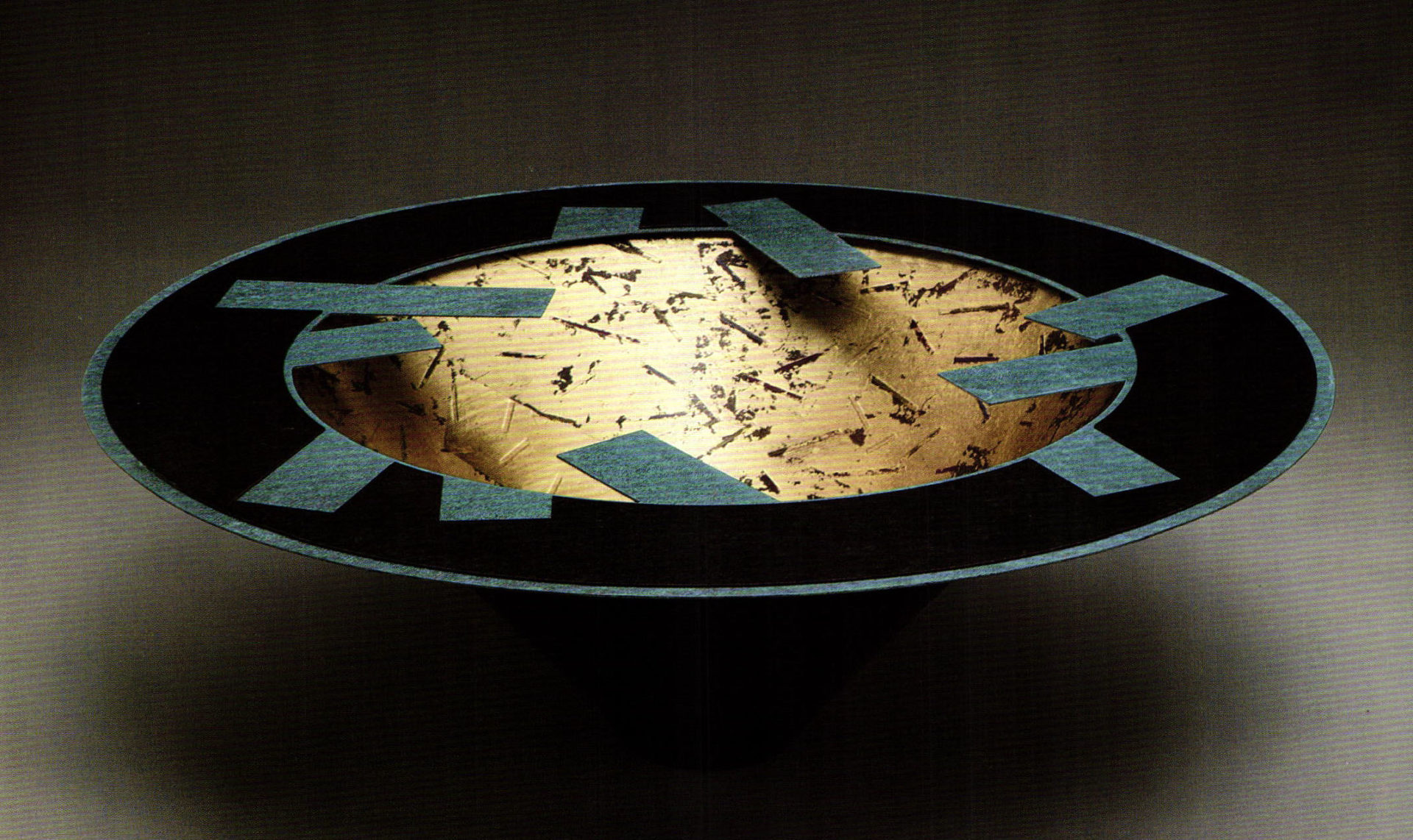
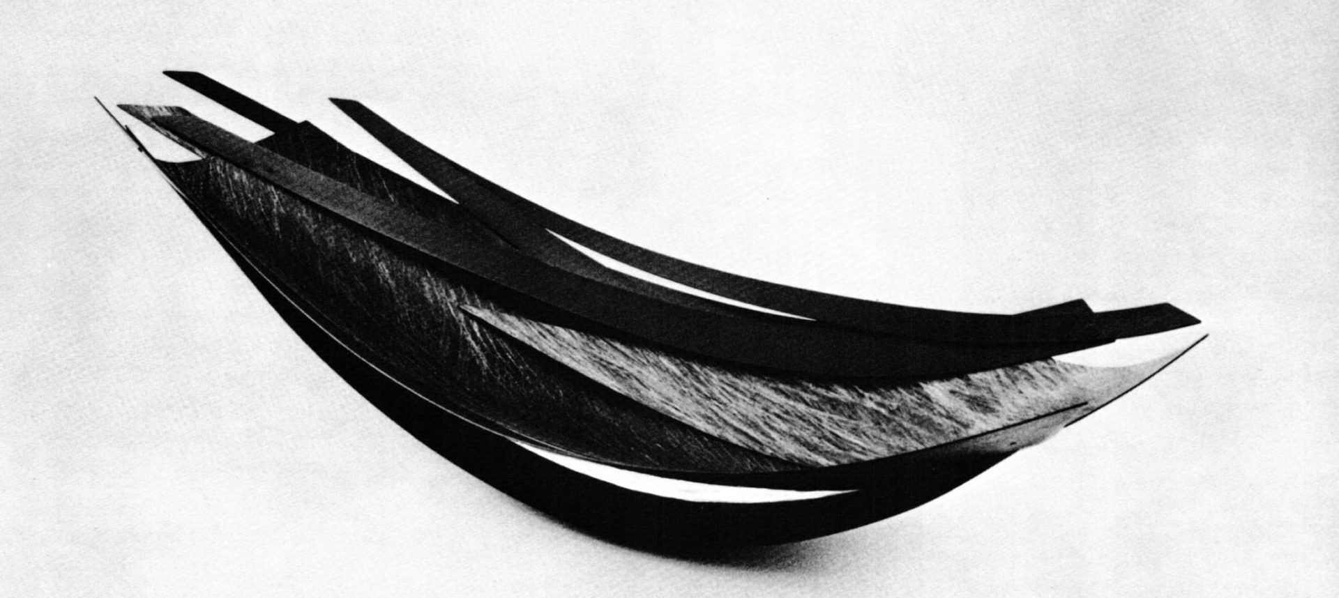
Asymmetry gave way to the circle, a simpler, smoother form. Small bowls were sunk in the center of large, fat rims, with oil pastels or prismacolor adding texture to the eye. Pulsing, spun and etched bowls began to appear. Helen Shirk located a company in San Diego that makes automobile hubcaps and contracted with them to spin her forms. "Fragile Growth" Vessel BV57E (1989) utilized a waffle-edged shape that was allowed to lose control or "rosebud" during the spinning process. Combined with patina and extensive use of etching, the graceful form appears to ripple in the wind. The structure seems deceptively delicate, a quality important to Shirk: "This is all things that appear to be fragile, but have a tenacity and unseen strength. These are not as fragile as they look."
Shirks "Double Bowl" series presents a vessel-within-a-vessel. The movement, once caught visually in a freeze-frame of silver and titanium jewelry, now became real, as pieces were physically manipulated to change a view and alter a perception. The first pieces of the series displayed two etched bowls, riveted one within the other, creating a play of light, shadow and line. In the next group, Helen Shirk decided to leave the bowls unattached, offering the viewer an opportunity to see each separately or together. "I wanted to make each distinctive on its own. Yet when they are put together, they form something else."
Her most recent, and still continuing, series "On the Edge" retains implied movement, as multiple planes balance precariously on the rims of the spun, symmetrical bases. Shirk's earlier titanium jewelry pieces triggered an anxiety about touching them, in case they weren't all together. The works in the "On the Edge" series create a hold-your-breath reaction, lest you move too close and launch a domino effect of falling, patinated planes. "Sometimes I think of the work I did before 1983 as being done without access to all parts of myself," Helen Shirk explains. "I had only a soft focus image of what I wanted. It was intellectual, but not pertinent to how I felt. It was not grounded in where I was. My environment now nurtures me."
The aloofness of her early holloware and jewelry has given way to emotion, warmed by color, and played out in juxtapositions. Her work has taken an intimate turn, a personal sense of introspection that makes it even more compelling to watch.
Janice Keaffaber is a writer and enamelist living in San Diego. She is the former editor of Enamel Guild: West publication, The Vitreous Voice.
Related Articles
Patinating Brass Alloys Using Contact Plating

Testing Japanese Patina Solutions
Iridescent Patina Recipe

Patination by Copper and Copper Alloy Fuming


The All-In-One Jewelry Making Solution At Your Fingertips
When you join the Ganoksin community, you get the tools you need to take your work to the next level.