Larissa Podgoretz
7 Minute Read
I was introduced to enameling during a required Enamels course at the Bezalel Academy Jewelry Department. We were given an exercise in each of the techniques and simultaneously were taught a method of systematic experimentation, i.e. learn how to learn.
When I did the painting technique plaque, I hit a snag. I painted a portrait in gorgeous living color, fired it, and as it cooled, watched a black and white image emerge. It frustrated and intrigued me. The result of this challenge was my graduation project, the 'panorama' necklace (see GoM Vol. 10, No. 5, pg. 244). The initial idea was for an inverse panorama that gave a 360 degree view of a miniature world without end. It was a composition of light and dark areas, of near detail and far away spaces. With the design done, I had to learn which colors would keep true through the firing, how to manage the colors to get even glazes and sharp detail. AII the plaques were painted together as a continuous unit, and then fired once in the end. It took me nearly six months to complete this project.
I worked in this method of painting on opaque color base until a few years later I was asked to restore and make supplemental pieces for some 17th and 18th century artifacts for the Greek Patriarchate of Jerusalem. This gave me a rare opportunity to learn by de-construction and expand the experimentation method I was taught at the academy. These enamels were not executed in any one technique. They incorporated as many processes as were needed to get the artist's 'vision' accomplished.
This is the method I have been working in since then. Design a piece with the enamel and the setting working as a unified concept. Determine what qualities I want the piece to express. Define the technical processes that can be used to get these qualities. Test all the possibilities in all the variations. Test the limits of the colors in terms of temperatures and repeated firings. Keep thorough notes on all the tests. Analyze the results, learn to understand and develop the unexpected 'accidents', these can sometimes give wonderful effects that could not be foreseen. Good records help learning how to repeat and control them. Do a test using all the chosen processes and colors that will be used in the piece to test their compatibility. With this approach, one's palette of colors, textures, depth and detail is limited only by one's imagination.
Over the last number of years, I have done some pieces in a larger format. The larger 'canvas' allowed me to carry the work I'd been doing in jewelry a stage further, learning to sustain the same level of quality but without the restriction of 'wearable' size.
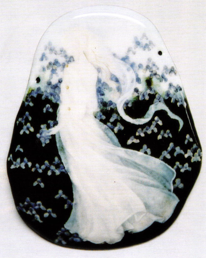
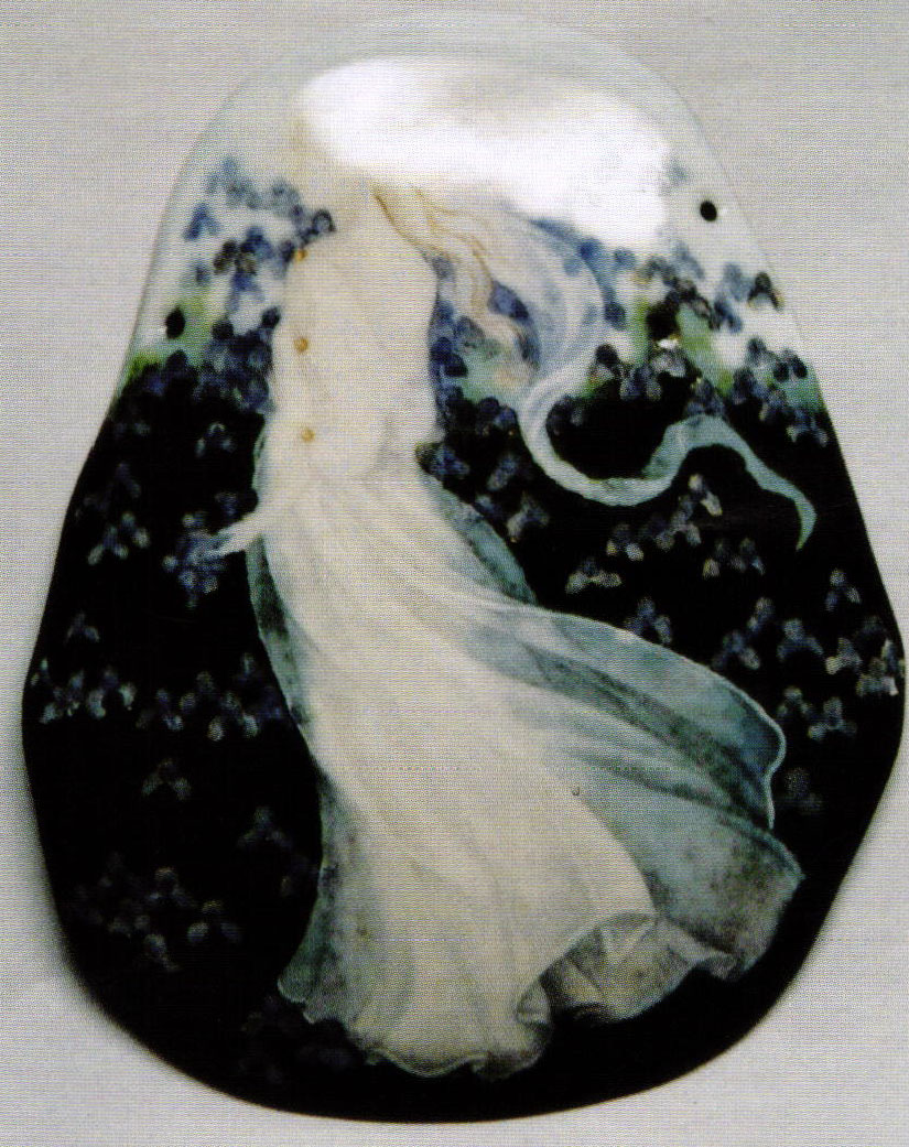
The three pieces, 'Water-Lilies', 'Poppies', and 'Iris' were commissioned as freestanding objects (see front and back cover, this issue). The last of them had a number of guidelines. It was to have the 'Iris' theme, metalwork similar in 'feel' to the earlier 'Poppies", to have a figure and a lighter color-field than the previous work.
Design
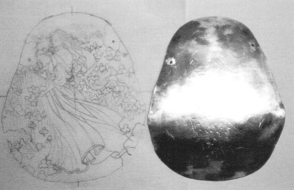
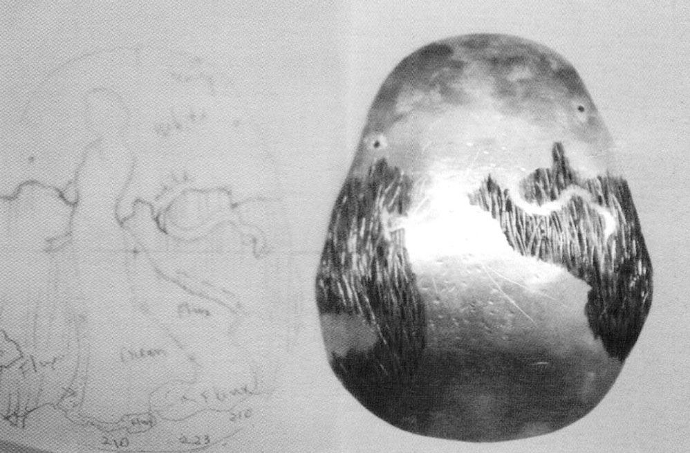
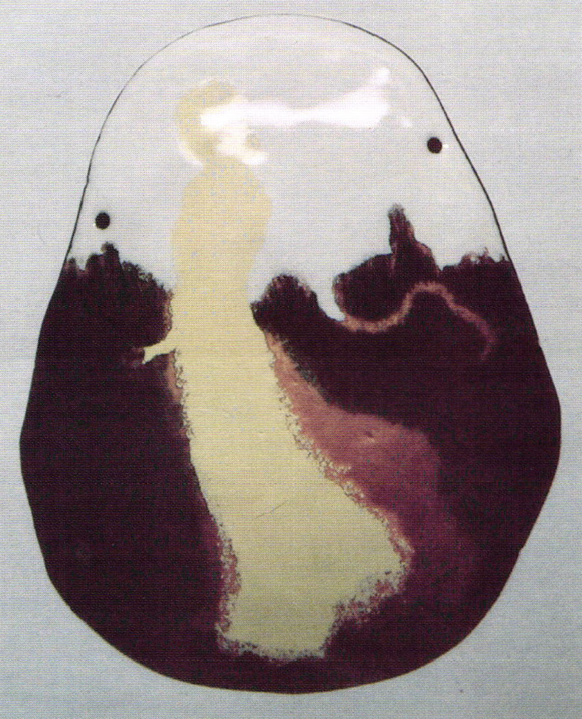
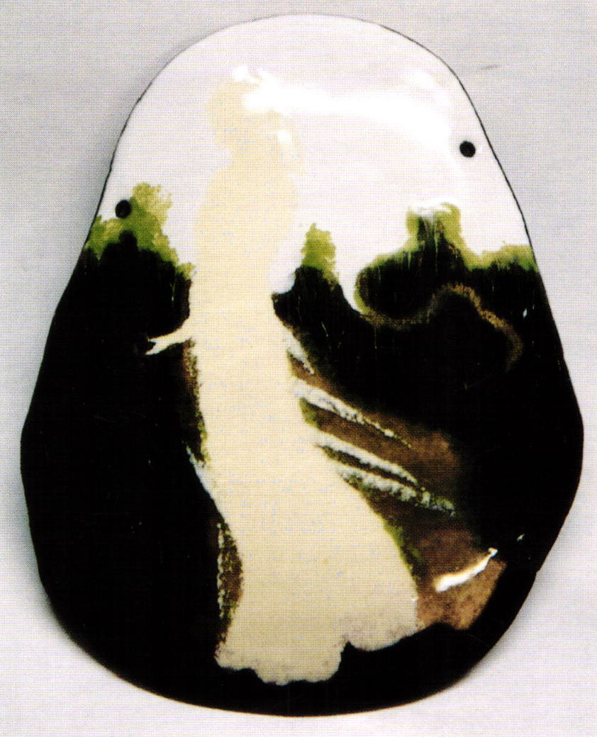
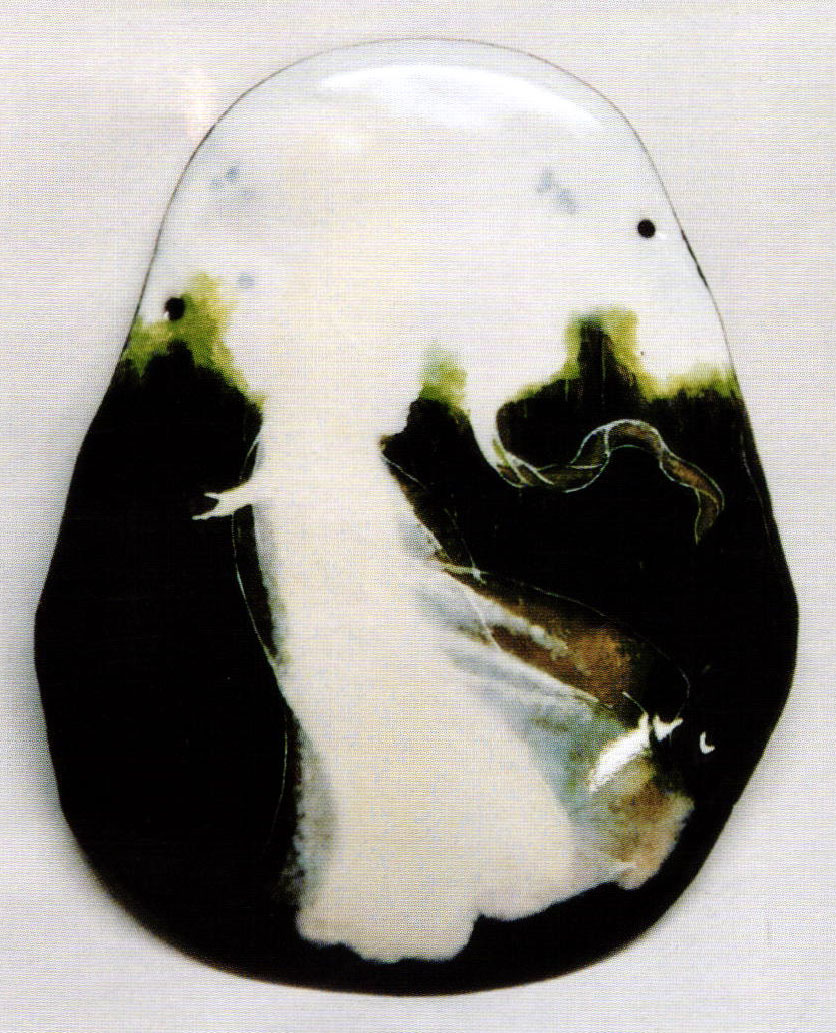
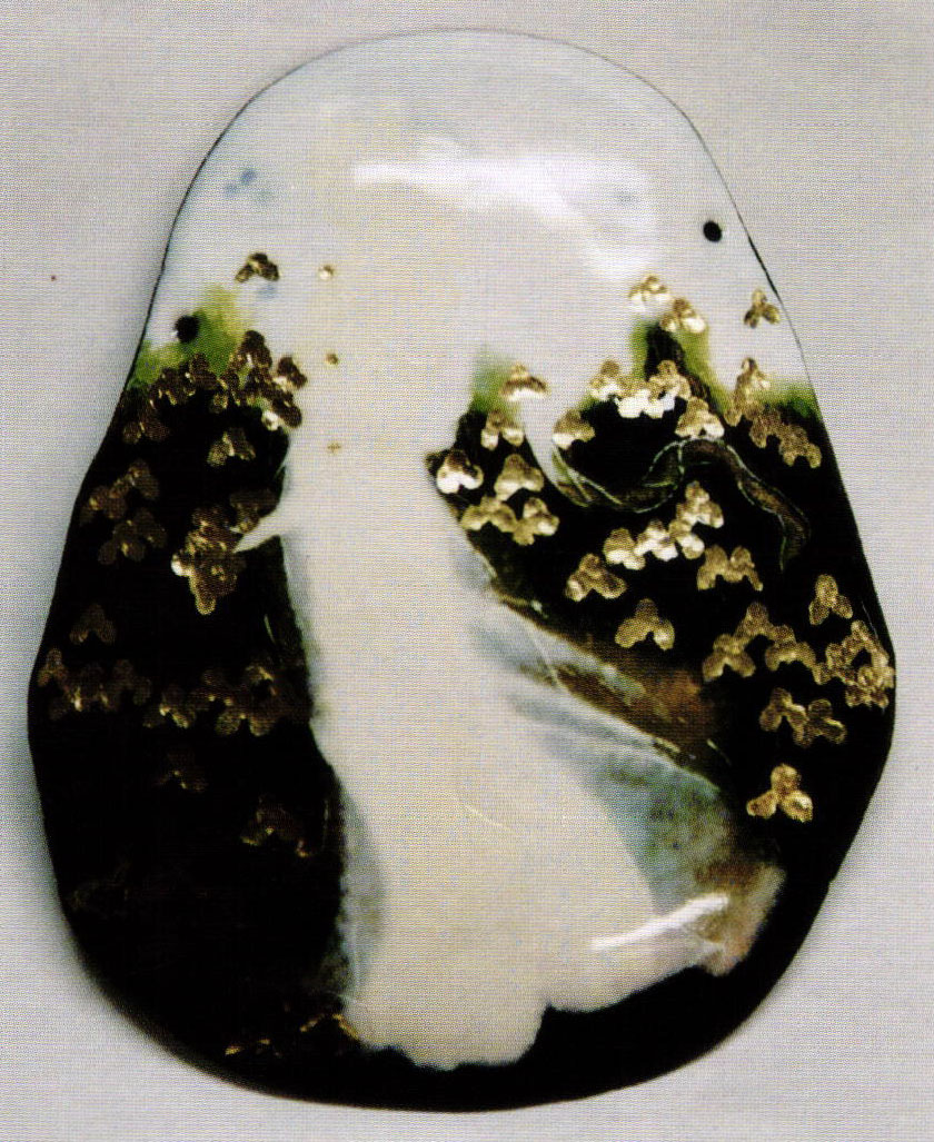
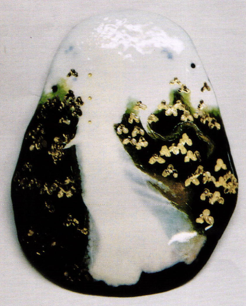
I developed the design to use a full figure standing in a field of iris receding toward the sky. The figure walking into the field draws the viewer inside. The windblown hair veil and dress create movement and forms that are repeated in the overall shape of the frame and the lines of the gold work. I wanted the 'iris field' to have depth, to be tangibly three-dimensional in the forefront and recede to a 'suggestion' of a subtler translucent, painterly treatment toward the upper 'sky' portion. The transition was originally designed to be more gradual and allow for more light area at the top. But in the tests, it did not create a strong enough contrast for the figure, so the design was reworked. The final version made for an effective background for the sheer parts of the dress, gave a soft pale background for the delicate dark hair detail, and worked well with the dark copper as a contrast for the gold elements. The colors and textures of the materials of the frame are echoed in the center plaque. 'Soil' areas, left and bottom, are a variation of the rich deep brown of the subtly hammered texture and dark patinaed copper of the frame. The gold foil underlay of the blossoms and the jewel clasps on the sleeve connect visually with the gold elements of the frame. The painted iris in the plaque are repeated in the sculptural shapes of the cast and enameled ones of the frame.
Enamel
Each element of the center plaque design was carried out in a different process. The lower field of iris was under glazed, engraved, and inlaid in transparent colors. Gold foil elements were inlaid for the blossoms, then inlaid with transparent violet and white opal to be painted later.
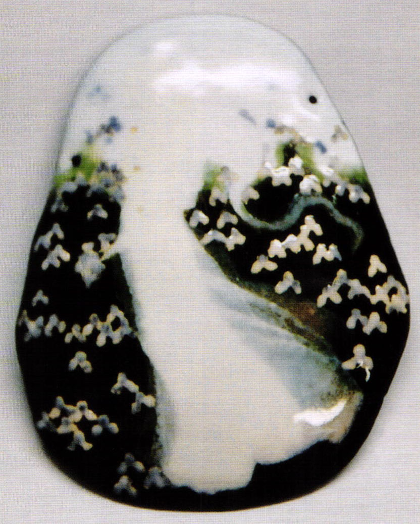
The sky was inlaid with a hard opaque white, then painted a sheer blue glaze, as were some iris, then fired. Gold foil was inlaid for a different shade of iris, fired, then overlaid with opal white to be painted later with overglaze colors. The figure was built in inlay of opaque cream for the solid center portion and flux for the sheer dress portions; this was overlaid with layers of opal grisaille. The 'soil' was built up with transparent browns and flux over fire scale in a number of firings. The veil was partially inlaid with opaque white and transparent green, then completed with grisaille, white opal, and painting. All the parts were brought to the same level, stoned, and re-fired. The complicated part was finding colors that would be compatible and could be sustained for all the stages. There were three different white opals of different meshes used for their different degrees of transparency. The final stages were layers of painting with overglaze colors and an opaque grisaille painting white to create the detail of the figure and iris. The plaque was fired between 30 and 35 times.
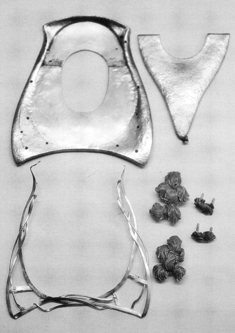
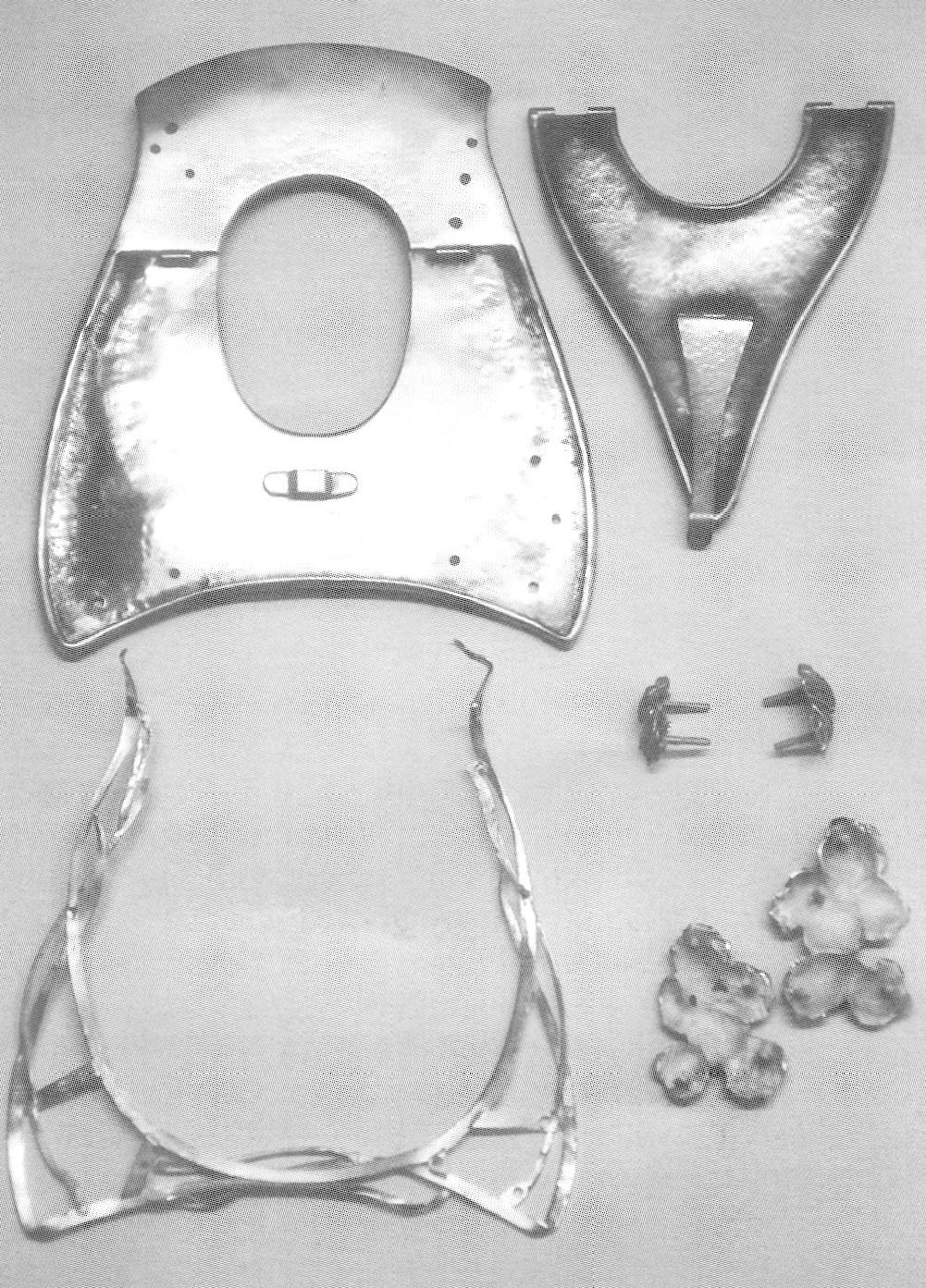
Construction
The enamel plaque was lightly domed copper with holes for assembly. The copper parts of the frame were shaped in pitch and hammered. The top part was made to fit the finished enameled plaque exactly. The back support was constructed and ail the hinge parts were fitted and soldered on. Gold elements of 18k gold leaves, buds and stalks were constructed to create a basket to hold the enamel in place. When the copper frame and gold work were finished, the enamel plaque was fitted in place and the 'Iris' elements were carved in wax to fit precisely over all the layers. The elements were cast in 18k gold. After cleaning the casting, 18k gold handmade screws were soldered to the flower elements. These were enameled with opal enamel that had been matched by the painted ones on the plaque. The enamel was etched to a soft matte finish to allow the gold texture to show through, and allow the rich 'fire' of the opalescence to come through without glare. The gold irises serve as the heads of screws that hold all the layers of the piece together. They are fastened at the back with handmade nuts.
Looking back at the years I've worked in this amazing medium-the subject matter that occupies me is still largely the same-landscape, nature, and the female form. The sensibility and the tools have evolved. Each project is a co-operative effort between my 'ideal' vision, patience, open mind, metal, glass and fire.
Related Articles

Ador: Professional Arts Guild

The Jewelry of Glenda Arentzen
1988 SNAG 20th Anniversary Conference

In Memory of Saraa Hopea-Untracht, 1925—1984


The All-In-One Jewelry Making Solution At Your Fingertips
When you join the Ganoksin community, you get the tools you need to take your work to the next level.