Photography Considerations
Three - dimensional objects will be well served by the methods described before, such as overhead diffuse lighting, fill card and mirror use. For flat things (like prints) use copy set - ups which primarily consist of extremely even light on the object and the camera centered properly on the work. Shiny things will need tents. We did, however, ask a number of craftspeople and artists whether there were any special considerations they felt were associated with different media. The following is derived from their comments.
7 Minute Read
Three - dimensional objects will be well served by the methods described before, such as overhead diffuse lighting, fill card and mirror use. For flat things (like prints) use copy set - ups which primarily consist of extremely even light on the object and the camera centered properly on the work. Shiny things will need tents.
We did, however, ask a number of craftspeople and artists whether there were any special considerations they felt were associated with different media. The following is derived from their comments.
Paper and Flat Art
Sue Archer and Georgia Deal made these points: It is important in dealing with paper to retain some sense of relief and surface texture. This could be accomplished by varying the light distances a bit or adding a side lighting source to the copy set - up. Color saturation is a tricky one and you will just have to experiment. Try Kodachrome to see if you like it any better than the tungsten films. In large objects in order to shoot the whole thing you may lose a sense of detail and so have to provide both a global shot of the object and several detailed shots as well. You will have to choose a compromise: color, bold graphic quality versus a sense of detail.
Textiles
Layne Goldsmith and Akemi Nakano Cohn contributed some thoughts. For textiles and quilts that are flat the considerations are similar. A sense of texture is very important and so side lighting helps. A raking light at about 30 degrees, from one side with a fill card on the shadow side can produce good results with a quilt (Collins, p 96). Lyn Pflueger, a Calgary fiber artist, says that because textiles, unlike metal, are non - reflective, they tend to 'suck up' light, so lighting is a problem. It's very easy to get an image that is too dark, or not sharp and clear enough. This can be remedied by lighting the surface strongly, using a gray card and bracketing. Presentation and display for the photograph is also a concern; hanging textile pieces on the wall is often convenient, but is not always the best solution because then you lose the sense of three - dimensionality that some pieces have. Tapestries can have relief parts in otherwise flat work. Again, some cross lighting can be helpful. Here's where mirrors are useful with their ability to spotlight specific areas on a piece.
Baskets
In regard to baskets Lissa Hunter and Crys Harse had the following comments. Depth of field is important, especially for larger pieces needing some 12 - 15″ depth of field. One may need to increase the general lighting levels or begin to use longer exposures than 1 second. If you are getting a camera for such objects then you might want a camera that has settings for longer time periods than a second. Depth of field is important for woven pieces where specific weaves matter. This is because structure is very important to basket makers. Therefore with baskets it is important to take good detail shots of the surfaces and structures occurring. There is some concern about trying to convey the intimate, tactile, close understanding of the material and process experienced by the maker.
Harse also wants a background light enough to translate well into both black and white slides and prints or even black and white laser prints. My suggestion would be to try a white shooting surface and work with the lighting to obtain a drop shadow effect. Texture and its subtleties are of importance as well. It would therefore be good to use side lighting and miniature spotlighting with mirrors and perhaps judicious projector use as well. Fill lighting is very important to lighten shadowed areas. Be careful of what shadows are doing on the object and background.
Another theme very important to basket makers (and to many people who make vessels) is the play of inside and out and what that means. Therefore position the camera so you can see some of the inside of the object to better describe it (a vertical shot for instance at 45 degrees downwards towards the object).
Ceramics
In regard to ceramics we asked Barbara Tipton and Peter Beasecker for some comments. As someone who publishes a ceramicists magazine, Tipton finds that most problems with submitted photos stem from ceramists hiring photographers who are versed primarily in 2 - dimensional objects, when specialized product photographers would be more familiar with 3-D work. Depth of field is important, and the ability to show surface textures. So, side lighting, long exposures, mirrors. The degree of glare and reflection is very important in indicating a particular quality of surface or glaze. This means side lighting and spotlighting to reveal those qualities. Watch out for hot spots. Beasecker tones down a hot spot by blotting the surface with beeswax (I'd avoid this on some porous or textured surfaces). Broad soft box lighting from above along with fill cards works well with many ceramics so that one is reflecting light back upwards against the object from the sides. Dealing with portraying the scale of work: its size can be a difficult thing and a concern. Inserting a penny or a ruler to indicate scale is simply not done any more. An additional shot of the artist at work in the studio along with the object can be a good way to indicate scale. Tipton had some concern about people using the correct film types. Regarding composition of photos sent in for publication: for technical reasons, leave enough background space around the object.
Jewelry
Because jewelry is the focus of most of my own photography, the approaches I've said I use personally throughout the text work well for most jewelry objects. Coins work well with side lighting of various kinds; experiment also with altering various lights distance from the coin.
Wood
Henry Schlosser was our consultant for wood. He emphasized documentary, rather than 'artistic' photographs (it's that 'neutral background is better' again). Magazines like an unobtrusive background so the object itself is the focus of the picture. He noted problems with hot spots and fill lighting. Good lighting is very important because colors tend to be very subtle, and you want to be able to make out different colors. You might experiment again with film types here. An issue he noted too is one that sometimes occurs when photographing paintings: 'false color.' The film records a different color than you see: i.e. a white wood appears green in the photograph. Collins suggests that using a UV and/or an Infrared filter or even UV filter material over the lights may help this as the color differences are caused by the material fluorescing under excitation of the UV or infrared light being emitted by the photofloods. He has filter suggestions to compensate for this as well but notes it is a very complex subject (Collins, pp 66 - 67). For reproduction, Schlosser notes that magazines want fairly high contrast photos - sharp and 'crisp.'
Models
We asked Morgan B. Turney, the editor of Canadian Railway Modeller, for some comments. His largest concern in model photography is depth of field - specifically, what type of lens to use with an SLR camera to get good depth of field. Again we generally get greater depth of field by playing with lighting levels, small f-stops and long exposures. Mirrors for modeling light on the objects would be useful. Detail, texture and color are of importance.
Mr. Turney himself uses a 28 mm lens with 2x extenders to make an f-stop of 22 into one of 45, then cuts the exposure time in half to produce a good close - up with good depth of field. Hmm, sounds like he knows what he's doing - I refer model makers with further questions not answered in this book to your respective journals.
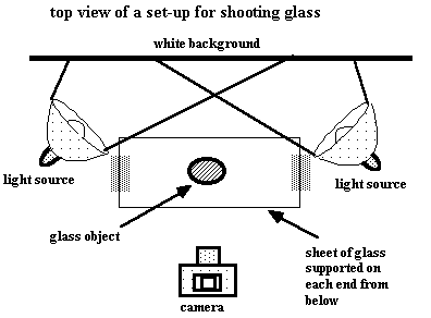
Glass
Many professional photographers cringe when someone brings them a glass object to shoot.
Transparency, hot spots, reflection, color are all special issues with glass. Plexiglas L's provide some good options for glass. Glass seems to work well when lit from below, from the sides or above through a diffusion screen or translucent white Plexiglas or frosted glass. You might try a tent. Defining edges with thin light streaks would come from fill cards and side lighting. One can cut out translucent Mylar® or white paper in the shape of the object and place it behind the glass to deal with the transparency problem as long as it doesn't distort the understanding of your object. A couple of set - ups that have been used for glass follow (from Bomback, p 160).
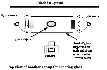
A similar approach produces quite different effects when the glass is lit from the sides (and possibly from below as well) in front of a black background (Meltzer, p 69). This lights the edges and any details within the glass. I don't use this approach but there may be a time when this will be a good solution for you, perhaps with paper - weights or rock crystals.
Related Articles

Holding Objects for Photography

Testing the MK Gem eBox

Small Objects Photography Check Lists

How to Construct a Portable Photographic Studio


The All-In-One Jewelry Making Solution At Your Fingertips
When you join the Ganoksin community, you get the tools you need to take your work to the next level.