Juried Exhibitions
There is nothing that will block the path towards acceptance in a juried situation more quickly than a poor quality or unintelligible image-- be it digital or film. The goal is to convey as much information about the piece pictured as possible without ambiguity or confusion. Relying on the jurors having any time or desire to puzzle out what is going on in an image will result in an irritated jury indisposed to accepting the entry. A poor image may indicate to a jury that the artist doesnt take their work seriously enough to find a way to document it well. When the competition is stiff (the amount of quality images/entries is high) this can definitely affect an artists chances of making the cut. There are certainly instances when a piece is so strong that it can shine through a screen of poor photography. But relying on that is faith misplaced. If the only true acquaintance a juror--be they an exhibition juror, book or magazine editor or gallery director-- has with a piece is the image taken of it, then that image had better make a positive first impression.
4 Minute Read
One important function of the guild is to provide opportunities for members to showcase their work. Toward this end there are non juried, totally inclusive venues (the Biannual show for example) for all members to publicly exhibit their work. This is vital to the mission and overall health of the guild. But it is also vitally important that a juried component play a role in the exhibition schedule of the organization.
Though exclusionary by definition, juried exhibitions attract a particular demographic within the guild that wishes to test their technical, design or conceptual abilities in a more competitive environment. Juried exhibitions also offer opportunities for members - often students - to build an exhibition track record for their academic resumes. Juried venues raise the bar and attract fresh talent. But who gets in and who doesn't in the end boils down to the opinion(s) of the jury. And while nothing can or should change that, things can certainly be done to improve a person's chances.
There is nothing that will block the path towards "acceptance" in a juried situation more quickly than a poor quality or unintelligible image- be it digital or film. The goal is to convey as much information about the piece pictured as possible without ambiguity or confusion. Relying on the jurors' having any time or desire to puzzle out what is going on in an image will result in an irritated jury indisposed to accepting the entry.
A poor image may indicate to a jury that the artist doesn't take their work seriously enough to find a way to document it well. When the competition is stiff (the amount of quality images/entries is high) this can definitely affect an artist's chances of making the cut. There are certainly instances when a piece is so strong that it can shine through a screen of poor photography. But relying on that is faith misplaced. If the only true acquaintance a juror-be they an exhibition juror, book or magazine editor or gallery director- has with a piece is the image taken of it, then that image had better make a positive first impression.
Obtaining quality images of your work does not of necessity mean parting with large amounts of hard earned cash. It is certainly within the grasp of most of us to learn how to shoot images (film or digital) that, while perhaps not quite up to publishing standards, are suitable for jurying. With that in mind we've listed below some things to watch out for.
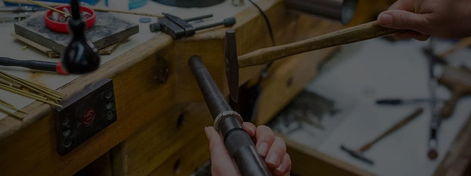
The technical aspects of jewelry photography.
Lighting!
Lighting is perhaps the single most important thing to consider. If the piece is underlit or too heavily shadowed it will create confusion. Drama is fine and can actually help to create a powerful impression. That being said, too much of a good thing can get in the way. Avoid a slick, magazine advertisement type of composition. Also, too much backlighting can create a silhouetted appearance in the slide that flattens the image and draws the eye towards the periphery.
Consider the background. Is it:
- somehow distracting?
- too busy or cluttered?
- too dark or light?
- does it bleach out the piece?
Does the object need to be recorded in context-that is, does it need to be sited on the body, on a wall or somehow installed?
Convey an accurate sense of the piece:
It should be clear in the slide what the object is, and the character of the surfaces and materials. (Some materials may be nontraditional, experimental or used in a new way. This is, of course, fine but how the material appears to the eye - Bits character — is crucial.) Yellow gold should appear yellow, Sterling should be silvery white if not patinated but not the glaring white of an overly "hot" image. These hot spots draw the eye and create misleading or distracting focal points. Highly polished reflective surfaces are tough to record with accuracy and clarity. They should never include a fun house mirror reflection of the camera, photographer, light stand or studio wall.
Provide information:
Label the slide clearly. At the absolute minimum indicate the orientation of the slide with an arrow (or whatever is required in an exhibition prospectus) the artist's name, title of the piece and the type of object. Ideally information detailing materials, techniques, dimensions and year of completion should appear on the slide mount. If you are including a slide list to accompany the submission, then a clear number corresponding to that list should appear.
Choose carefully:
Even with the best possible images work submitted should be appropriate to the theme or character of the venue. Production work conceived and designed to be worn at the office may not be the best choice to submit to an academic exhibition. And edgy, one of a kind pieces featuring controversial subject matter may not be suitable for submission to a church based craft fair.
It's also instructive to consider the venue in which it will be shown: if the strength of a piece relies primarily on some aspect of functionality, will that function be clear from within the static and remote confines of a display case? Is the piece strong enough visually to exist without some indication of its function? Not every piece can be shown successfully, no matter how interesting it may be, in every situation. And not every object, no matter how fantastic it is in the real world, comes across well in the flattened reality of the slide or digital image. Always go with the image that best blends all of the attributes required: a clean, well lit, straight forward image of a strong piece that best suits the parameters of the venue.
Related Articles
Silver: New Forms and Expressions Exhibit
1988 SNAG 20th Anniversary Conference
Trade Show Marketing Tip
Getting the Most Out of Trade Shows


The All-In-One Jewelry Making Solution At Your Fingertips
When you join the Ganoksin community, you get the tools you need to take your work to the next level.