
Considerations in Image Creation in Photography
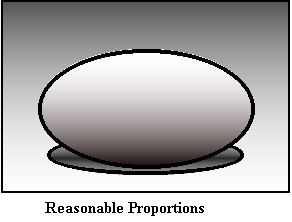
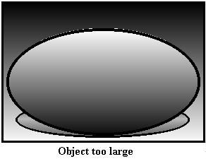
Now we're going to start talking about taking the picture - actually getting closer to taking the image. There's a couple of things that we need to think about. One of them is the size of the object in proportion to the image area (remember any cropping action your camera will inflict on the image seen through the viewfinder and also that you will lose some of the edge area under the slide mount). It should be just right, no too big and.
9 Minute Read
There are many things to consider when it comes to image creation in photography and this article shows how to identify and use them to your advantage.
Object Size and Proportion in Image
Now we're going to start talking about taking the picture - actually getting closer to taking the image. There's a couple of things that we need to think about. One of them is the size of the object in proportion to the image area (remember any cropping action your camera will inflict on the image seen through the viewfinder and also that you will lose some of the edge area under the slide mount). It should be just right, no too big and not too small.
Composition
Learning composition is an essential part of taking photographs. It's a bit like doing a painting, or a drawing; you have to deal with all the issues of composition that a painter, or a graphic designer, or somebody drawing something flat does. You are dealing with creating a piece of flat art (the slide or photograph), with two - dimensional composition and within the limits of the 35 mm rectangle (whose proportions as it turns out are based on the Golden Mean).
I suggest taking a 35 mm slide mount and holding it in your hand, looking at the world through it. Move it around and look at the shapes you see, experiment with relationships of line, harmony, balance and weight - that is, visual weight. Slide it around, and every now and again you'll think, "Hey, that's a good balance," or "Oh, that's a pleasant thing," or "That doesn't look good." Take it outside as well as indoors.
After a while you will not need the rectangle to look through to see the compositional relationships and you will be able to get a sense of these things just by choosing to look for them. Also, when you see magazine shots, have a look at what kinds of decisions the photographer made. Remember, for documentary studio photography of objects, in general the more neutral the background the better. So composition in our terms usually has to occur within and on the object at hand and concerns how its three - dimensionality, structure and surface qualities can best be portrayed.
Forget that it is a 3-D object
One of the hardest things about small scale photography of objects, and the one that screws you up most when you're starting, is that you must forget that the object you're looking at is a three - dimensional object, because what you're doing when you take the picture is working with a completely flat plane: the film - and the composition and the work that you're doing - has nothing to do with three dimensions. You're making a flat art object, just like working on a piece of paper.
If you get mixed up, and you imagine you are looking at a 3-D object, perhaps because you made it, and your physical experience of it as a three - dimensional object is strong, you can actually lie to yourself about what you see, and you can end up with bad pictures. So it's very important to distance yourself from the object, and when you're looking through that viewfinder, that rectangle is all there is - there's nothing else, and you're working with a flat composition. It's really important to try and remember that, because you'd be surprised how lying to yourself can make you completely miss what's happening right in front of you.
The Best View of the Object
As you compose the image, search for and find the best view. But before even starting to take the picture you should decide what the image is for, what it is supposed to convey to the viewer. This means a compromise between the greatest photo, most informative, dramatic, documentary, narrative, process - revealing and other requirements of the image of the object.
Does it have a handle, an interior? What are the qualities that best fulfill the demands of the specific shot? Goals and intentions that are different will demand different considerations in the image. The best view will depend upon the function of the photograph. Usually this has to do with conveying the most textural and form information about the object - which in general means one uses a large overhead diffuse light source, small spotlighting from mirrors and side lighting to emphasize texture. One attempts to avoid overly dramatic lighting effects on the object.
Front Lighting Flattens
An important basic principle about lighting your object: light directed from the front onto the object is called front lighting and front lighting flattens things, eliminates textures and relief.
Let's say you've put your object in the drop shadow box - perhaps it's an object of jewelry - you're looking through the lens and all of a sudden you see scratches that you had missed while finishing but you still need to take the picture. If you arrange your lights so they are falling directly onto the object from the front, from the direction the camera's view is from, you can almost eliminate those unwanted textures. All the scratches will disappear and you can take your shot anyway. I sometimes mount a small swiveling mirror with Fun - Tack on top of the camera itself for this purpose.
Side lighting picks up texture A second important principle is that side lighting picks up texture, highlights edges and enriches relief surfaces like cloth or textured ceramic or metal. Usually in taking photographs of three - dimensional objects one is trying to emphasize and intensify the textural effects on the surface of the work. We do this by side lighting, shooting light across the surface from the sides. I usually place mirrors at each side of the object just outside of the frame and angle them to intensify the textures present.
Coins for instance might be lit primarily by side lighting to pick up the detail and subtle rounded reflective surfaces on the object.
Remember that in creating the flat art image of the photograph, one is attempting to create a 'super - real' image so the viewer can understand the object as a three - dimensional object. Because the object is reduced to a flat image by taking a photograph one has to intensify its three - dimensionality in order to convey a sense of its presence to the viewer. As well as letting us see textures and relief details, side lighting is used to create a razor - thin white edge to the sides of the object which defines its edges and makes it stand out from the background of the image. This edge lighting is very important in making a piece stand out from the background, framing it and defining it in space in the photograph.
An interesting way of subtly creating a sense of texture is to move the side lights different distances from the object; this will introduce a hint of shadow to textured areas such as cloth or cast paper. Some day if you are feeling experimental try turning different lights off one at a time in the system or moving them to different distances from the object, and observe carefully the resulting lighting effects on your object.
A traditional experiment to learn about lighting is to take a roll of photographs of a white object on a white background (an egg for instance) and make notes of different exposures, lighting methods, fill cards etc. While this is used mostly when learning about black and white photography and printing it can also be a useful exercise with color slides.
Contrast
The issue of contrast is an interesting one (see Collins, p 115). It is difficult to see what the contrast is on an object. Try and see what is in front of you in terms of grays in order to get a sense of the contrast on an object. You can squint and fuzz your eyes to help see this, sunglasses (perhaps those yellowish ones?) might also help. You have to reduce what you are seeing to a simple (black/white/gray) level in order to evaluate the level of contrast on the object. This will take practice and is just something to be aware of when evaluating your shot.
Shadows
One has to be careful of shadows. Cast from the object they can either give it a sense of gravity and place on the shooting surface or look odd and distort how the viewer understands the object portrayed. Be aware of the role of shadows both on and off the object. Many professionals try and avoid them altogether by cross lighting in such a way as to eliminate them. The diffuse light we use will create soft shadows; hard shadows are caused by non - diffuse light. Although most of our light is diffuse, the mirrors we use feed non - diffuse spotlighting onto the object which can cast hard - edged shadows. I personally like to use some sense of shadow on the shooting surface in an image to 'ground' the object, but I generally like diffuse, fuzzy - edged, not - too - dark shadows.
One can do a lot on purpose using shadows. The main point is to know they are there, to look for them and to consciously choose what part they will play in the flat image you are creating on the film plane.
Rendering and its Conventions
Creating an effective image through the viewfinder leads one to use the conventions of rendering, that is, the 'normal' ways that illustrative drawing and painting are designed to transmit information. Conventions of rendering include things like: there's a strong tendency to have the strongest light source falling from the top left - hand side of the image, edges are defined by extremely thin light streaks or very thin black lines, curving tubes have a light streak that is a line on them (much like on a spool of silk thread), rounded surfaces have a curving light streak, all objects lighten near their edges even in shadowed areas, a hint of blue implies silver or chrome, a hint of brown at the base of something grounds it - and so on. So have a look at drawings and renderings to begin to think about some of the issues that you have to deal with in creating a flat image.
Creating a Super - Real Image
When you're creating an image like this, it is not a blind documentation of the object - you could do that with a photocopy machine or a scanner - instead you're almost making a cartoon. You are creating a super - real image. You're taking a three - dimensional object, you're creating a piece of flat art about this object, and you want the person looking at this flat art - at the slide - to have a sense that they're seeing a three - dimensional object, so you have to take what's there and accentuate it, exaggerate it, make it more real than real. One creates an over - emphasis of what is there so that the viewer of the slide image obtains a deeper understanding of the object than would otherwise be the case. If you take a very careful look at excellent advertising photographs, you'll realize that the lighting that you're looking at is not possible in real life. Lights are coming from strange places, there are shadows that can't exist. Remember you are creating a super - real image, and it's flat.
Related Articles

Jewelry Photography Communication

Jewelry Photography Film Types
Proper Studio Light

Building a Photo Light Box


The All-In-One Jewelry Making Solution At Your Fingertips
When you join the Ganoksin community, you get the tools you need to take your work to the next level.
